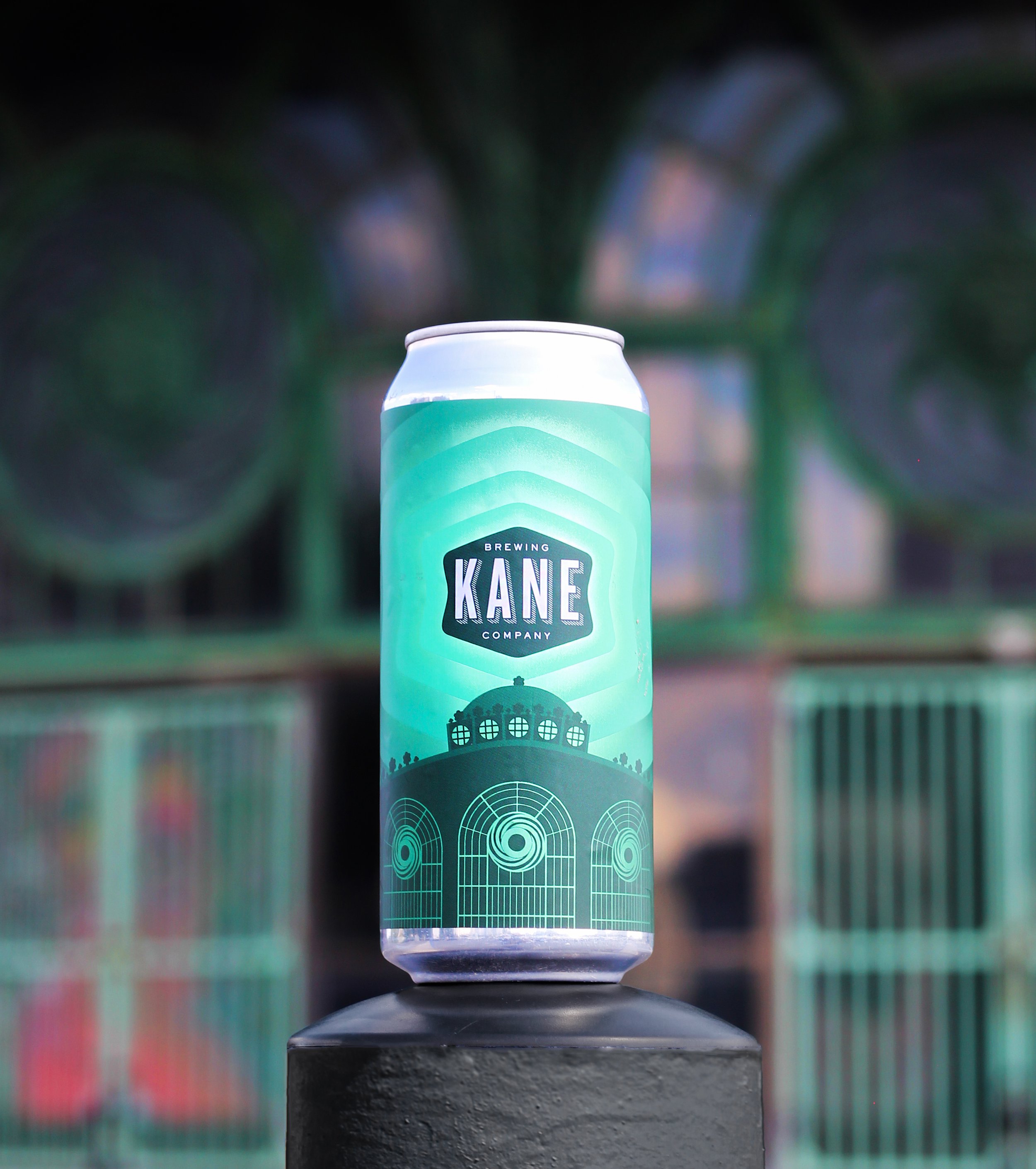
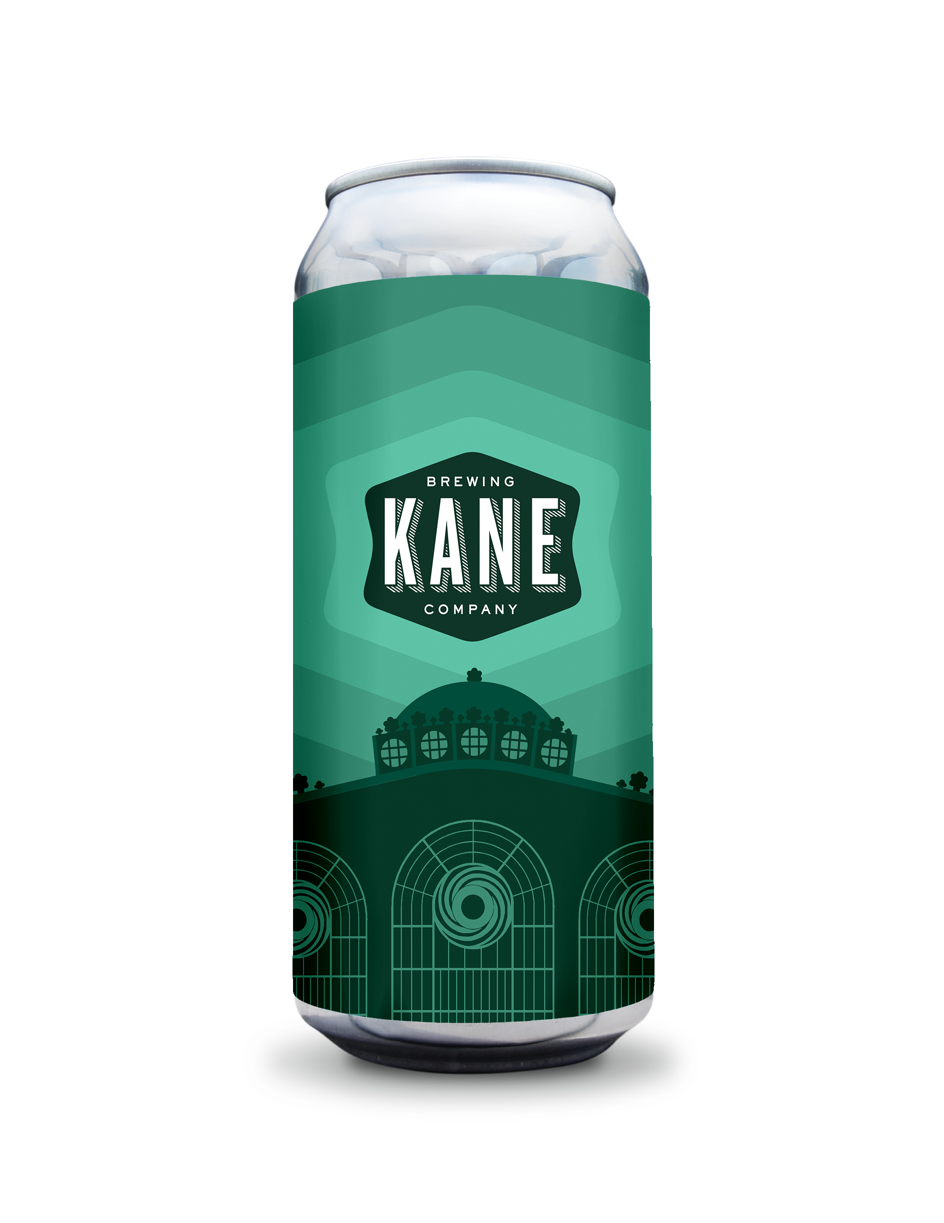
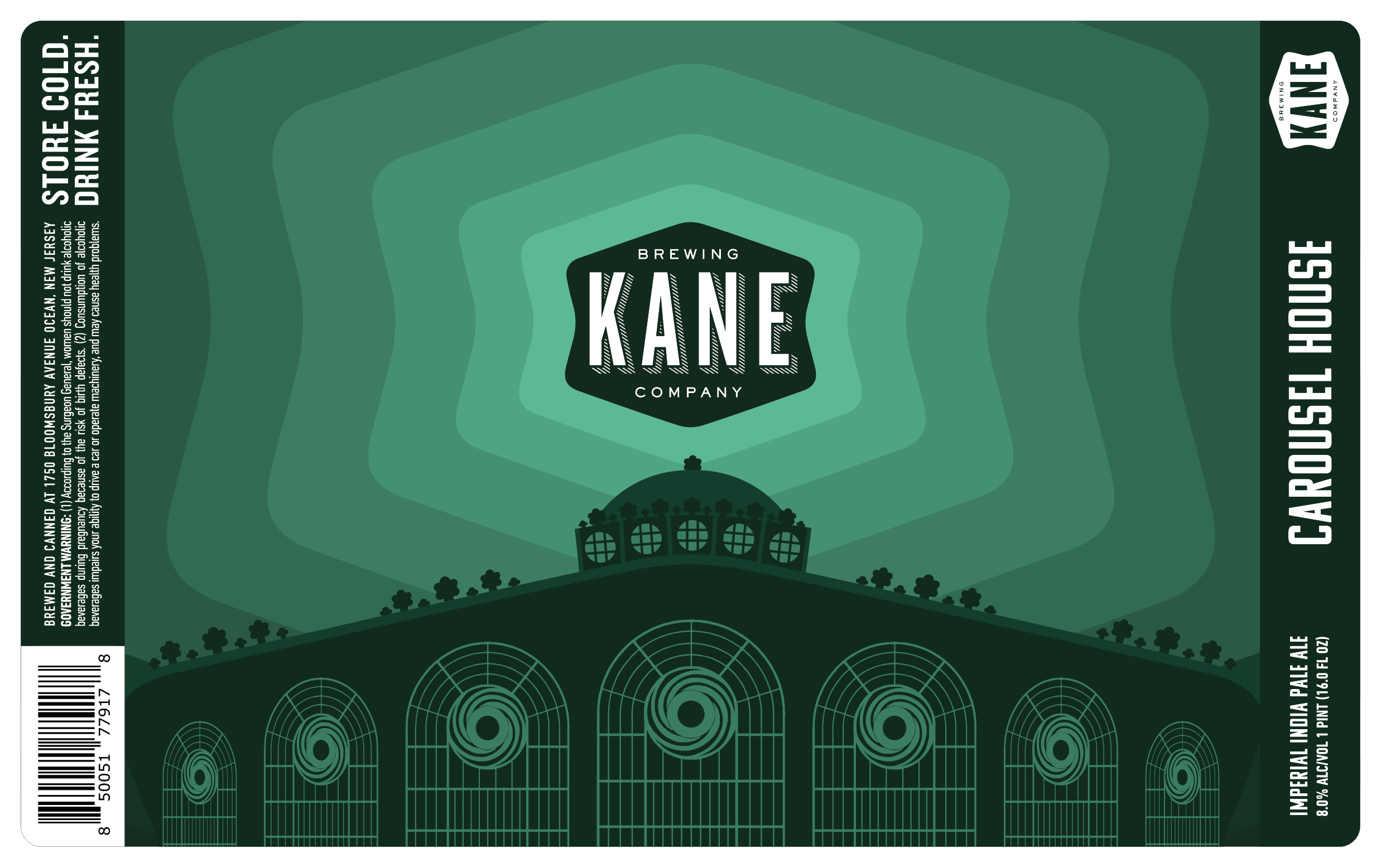
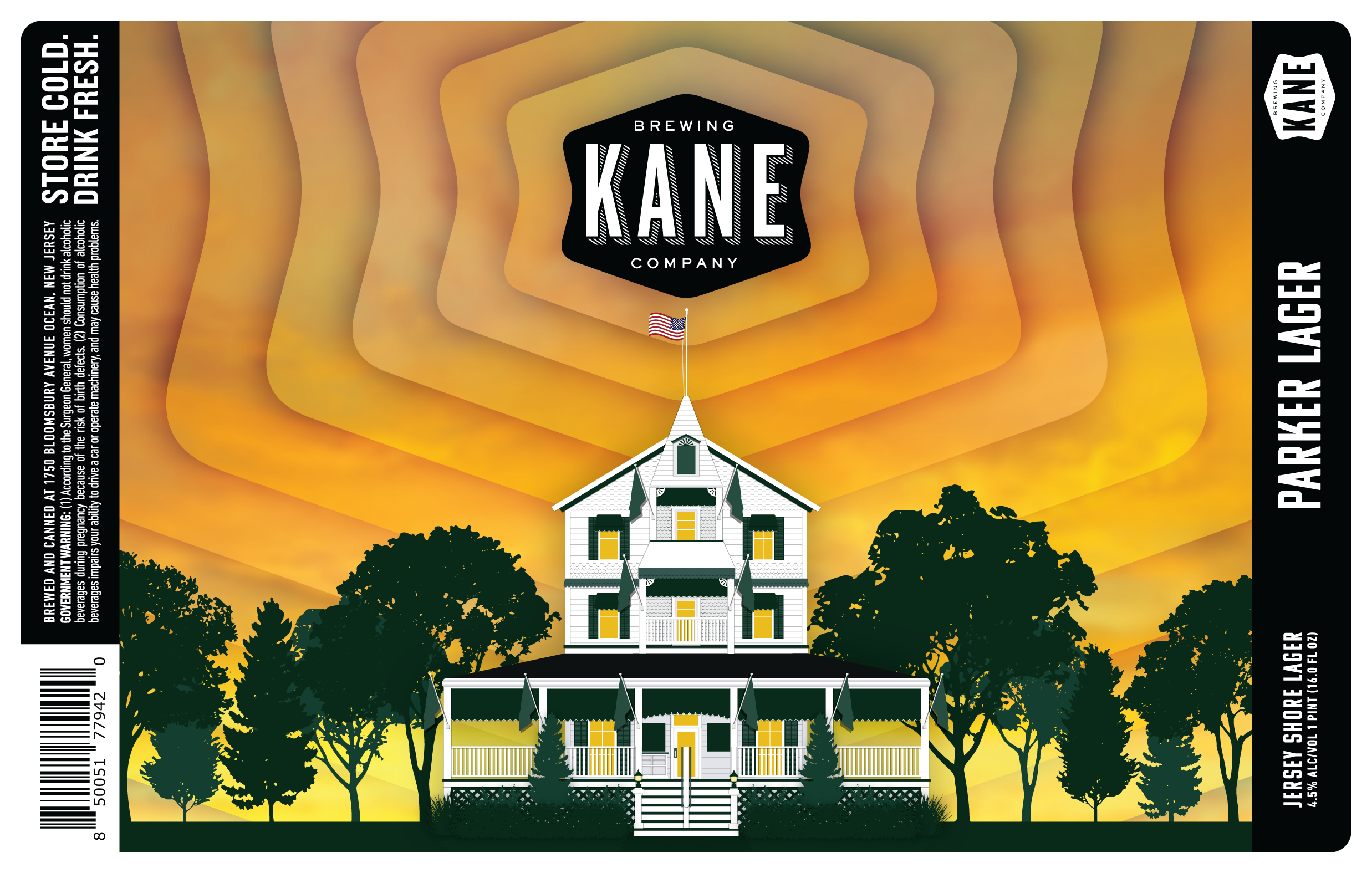
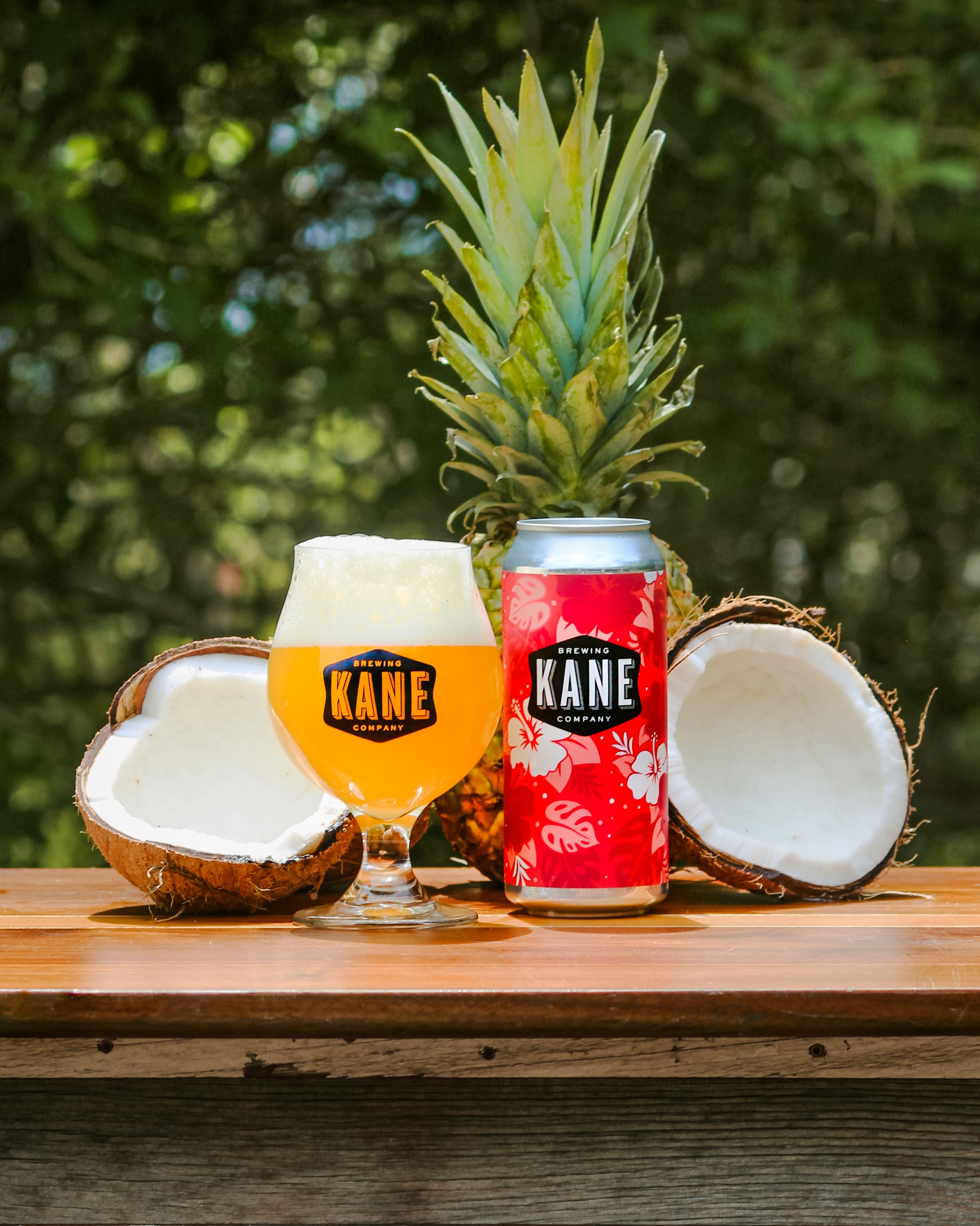
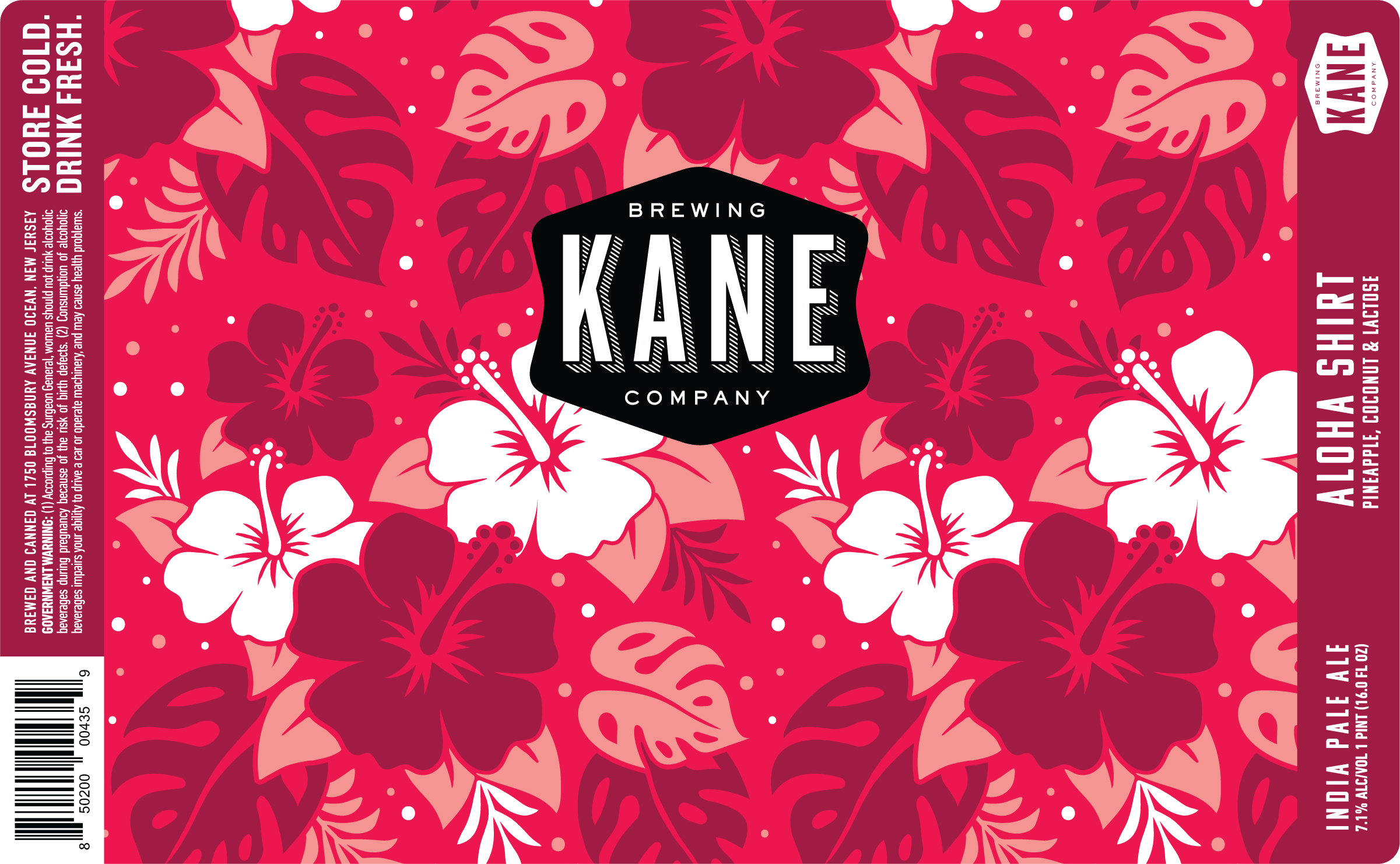
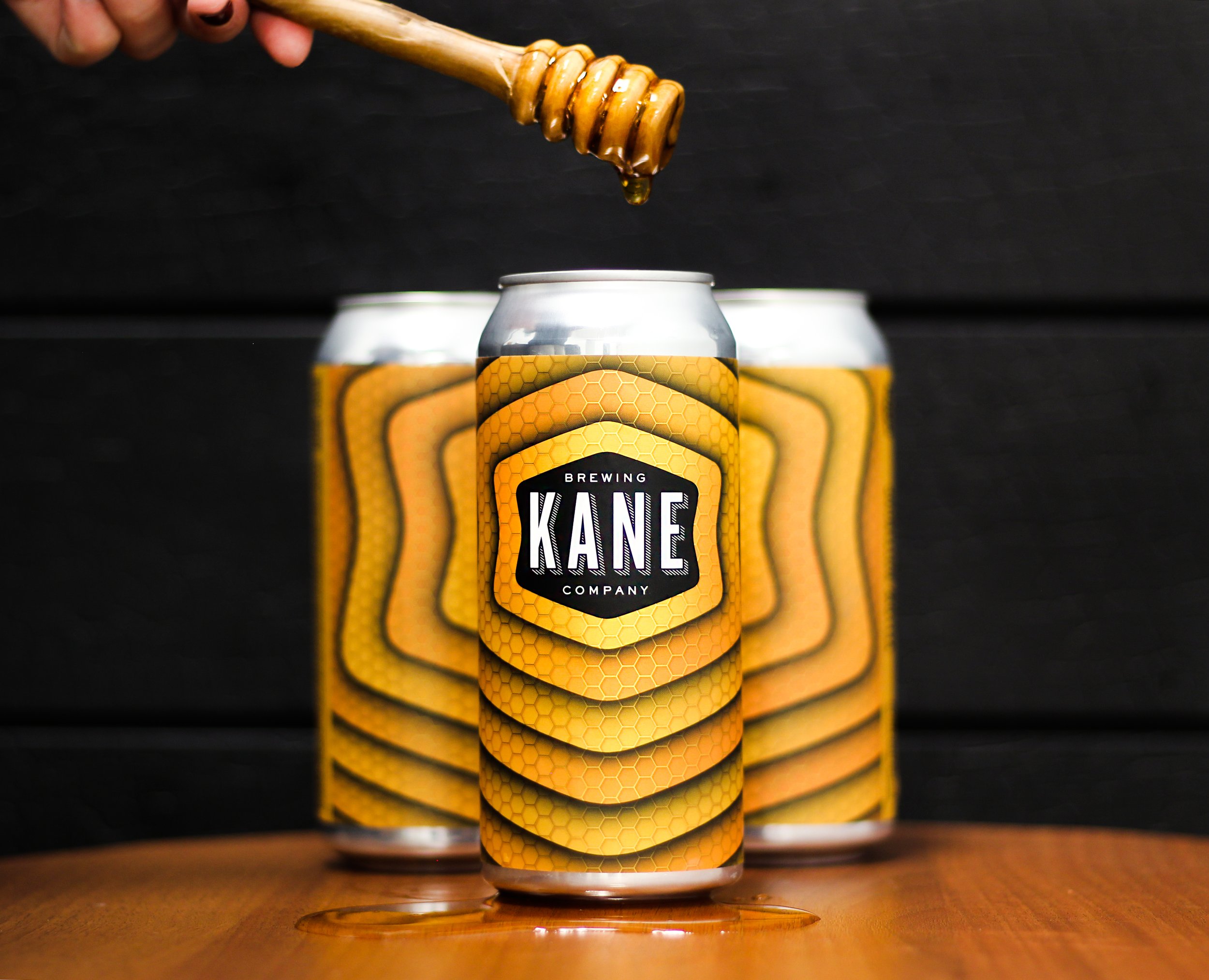
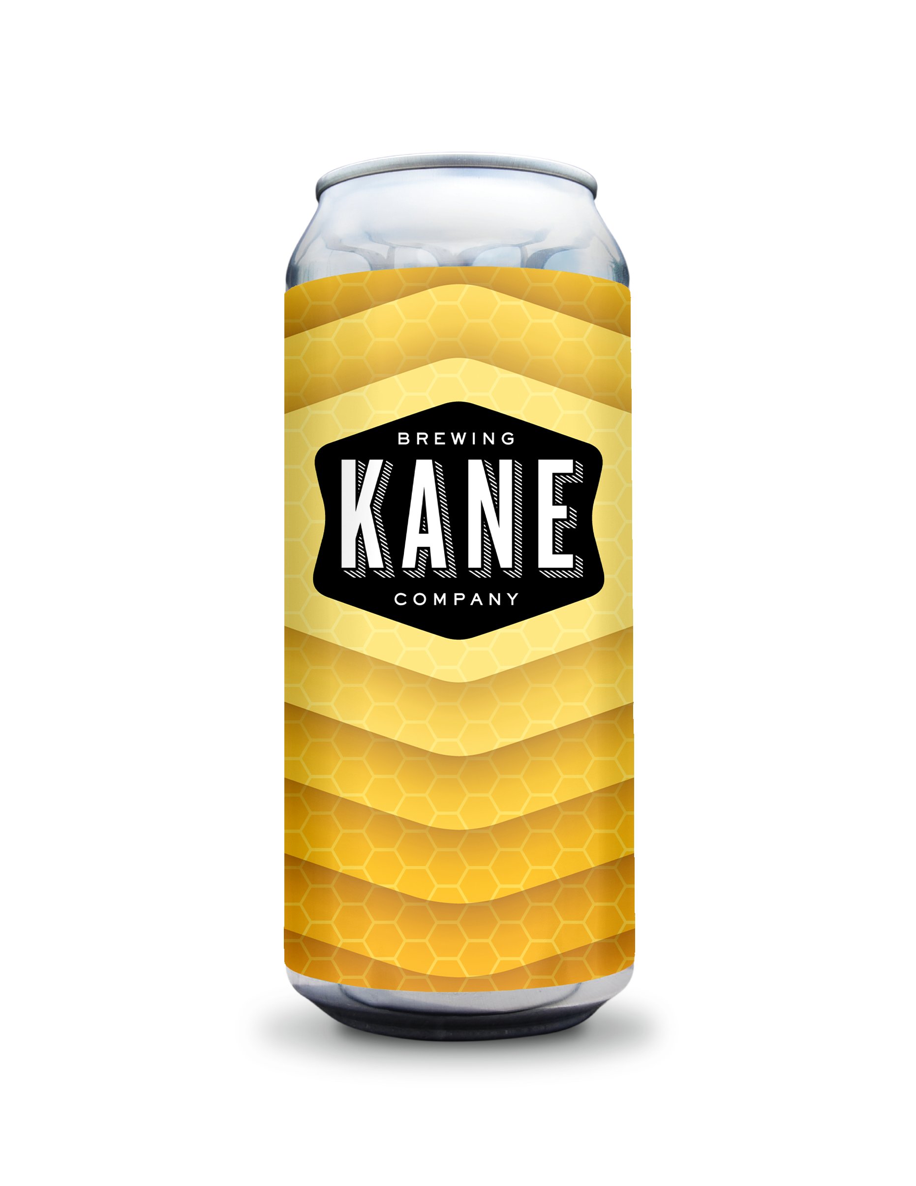
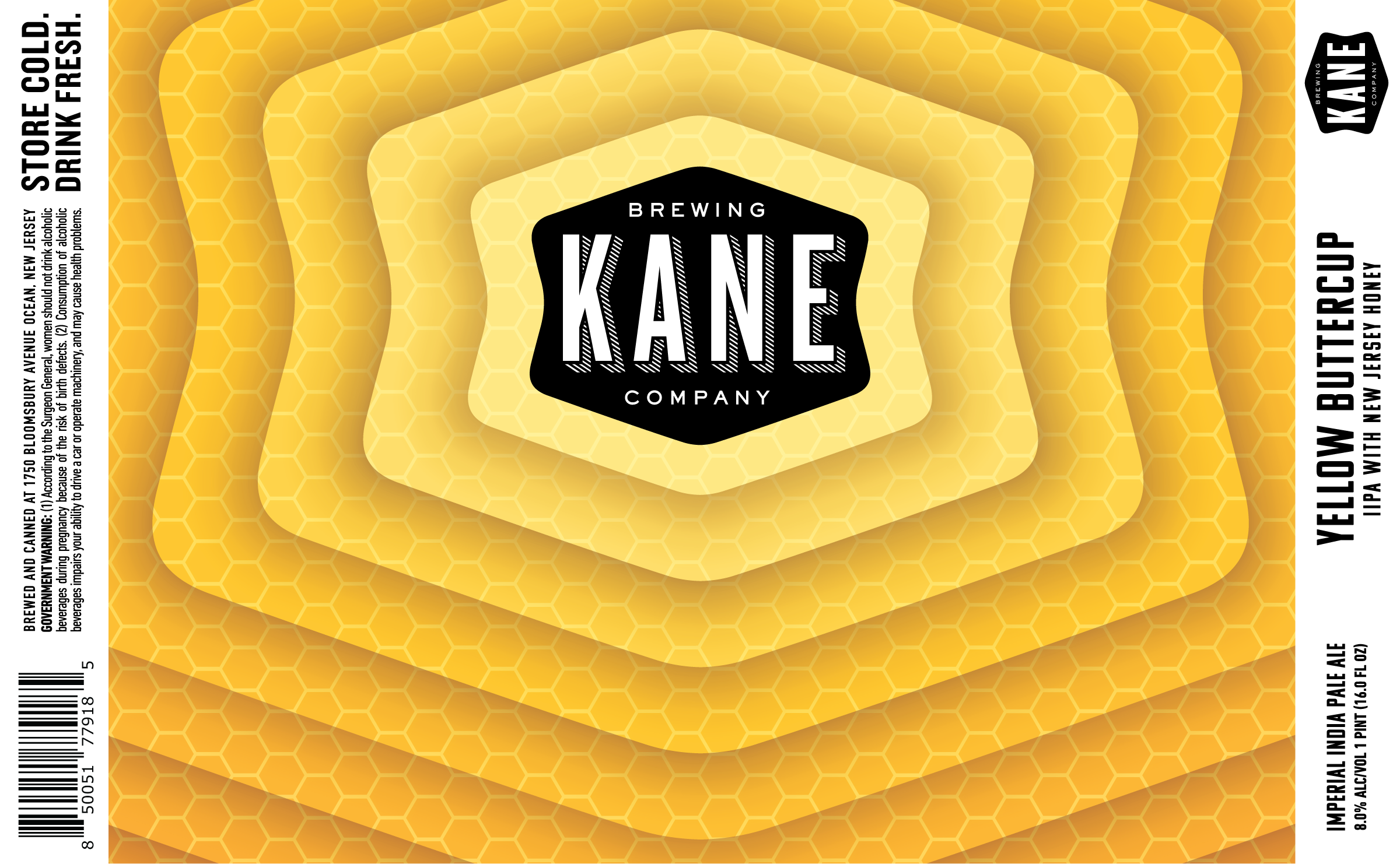
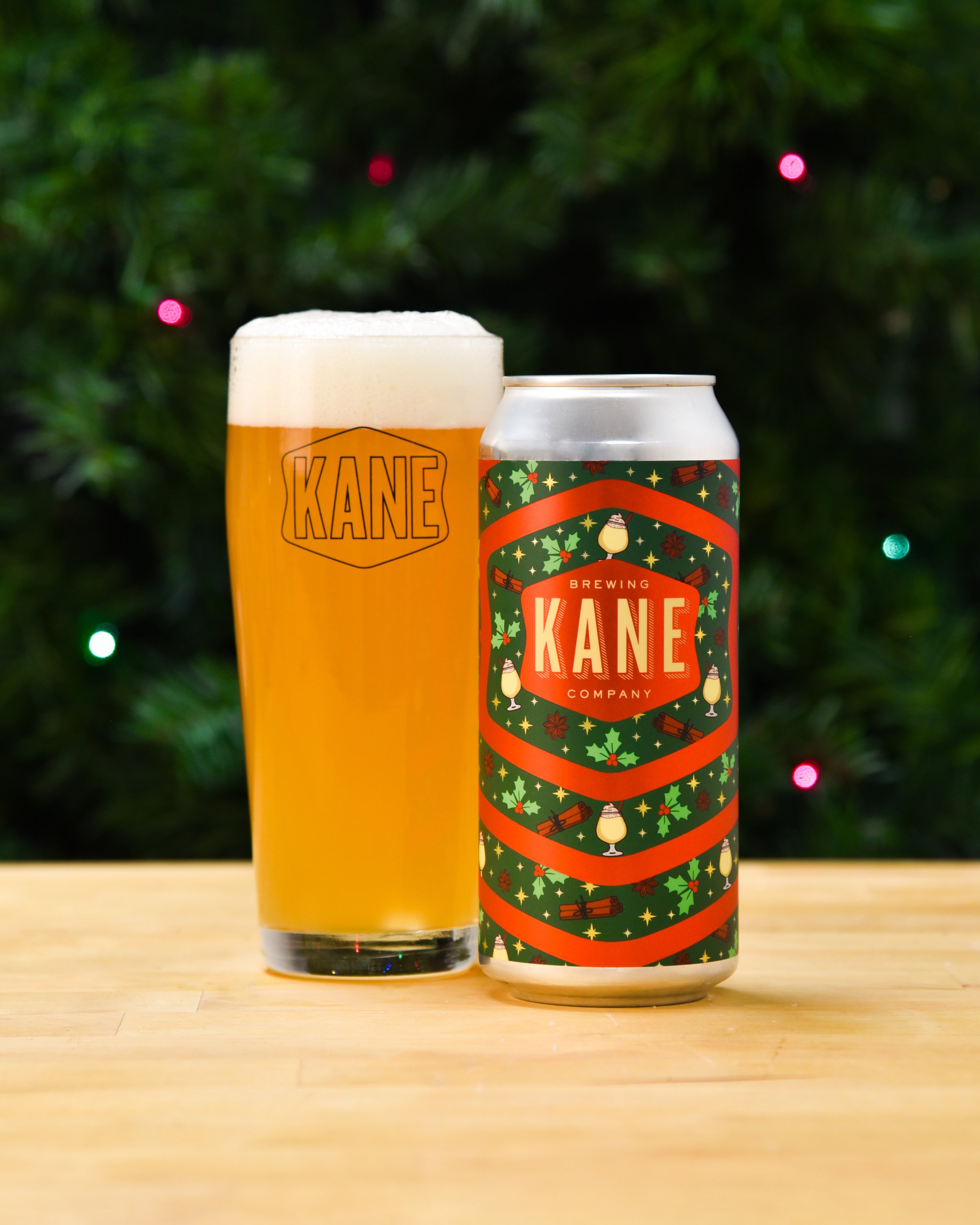
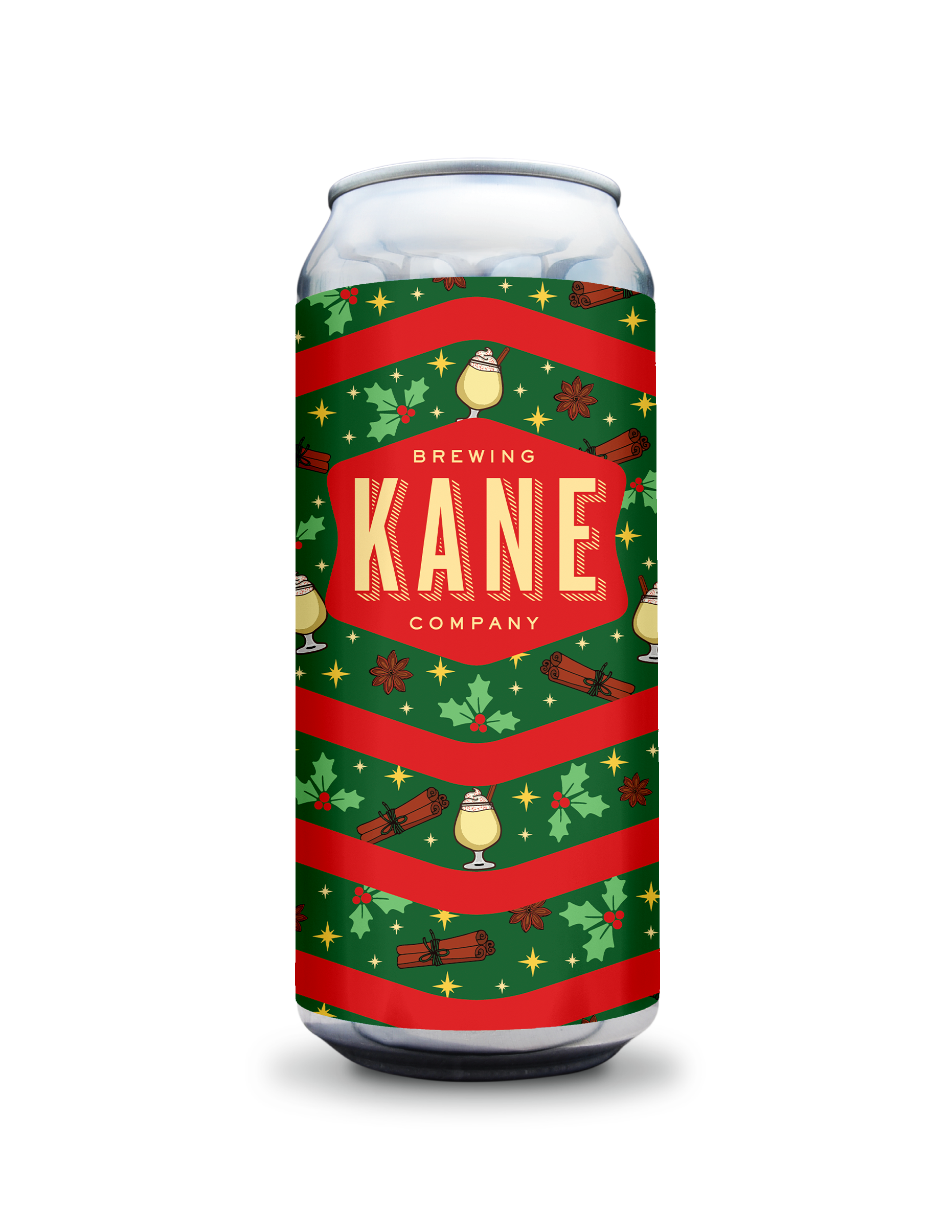
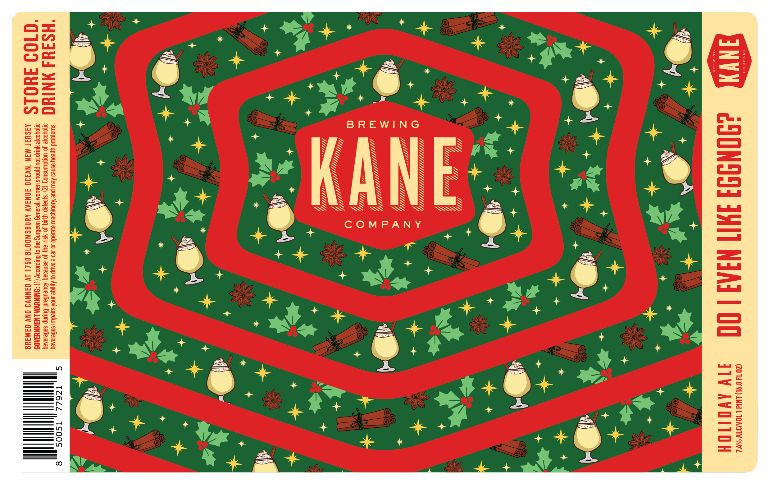
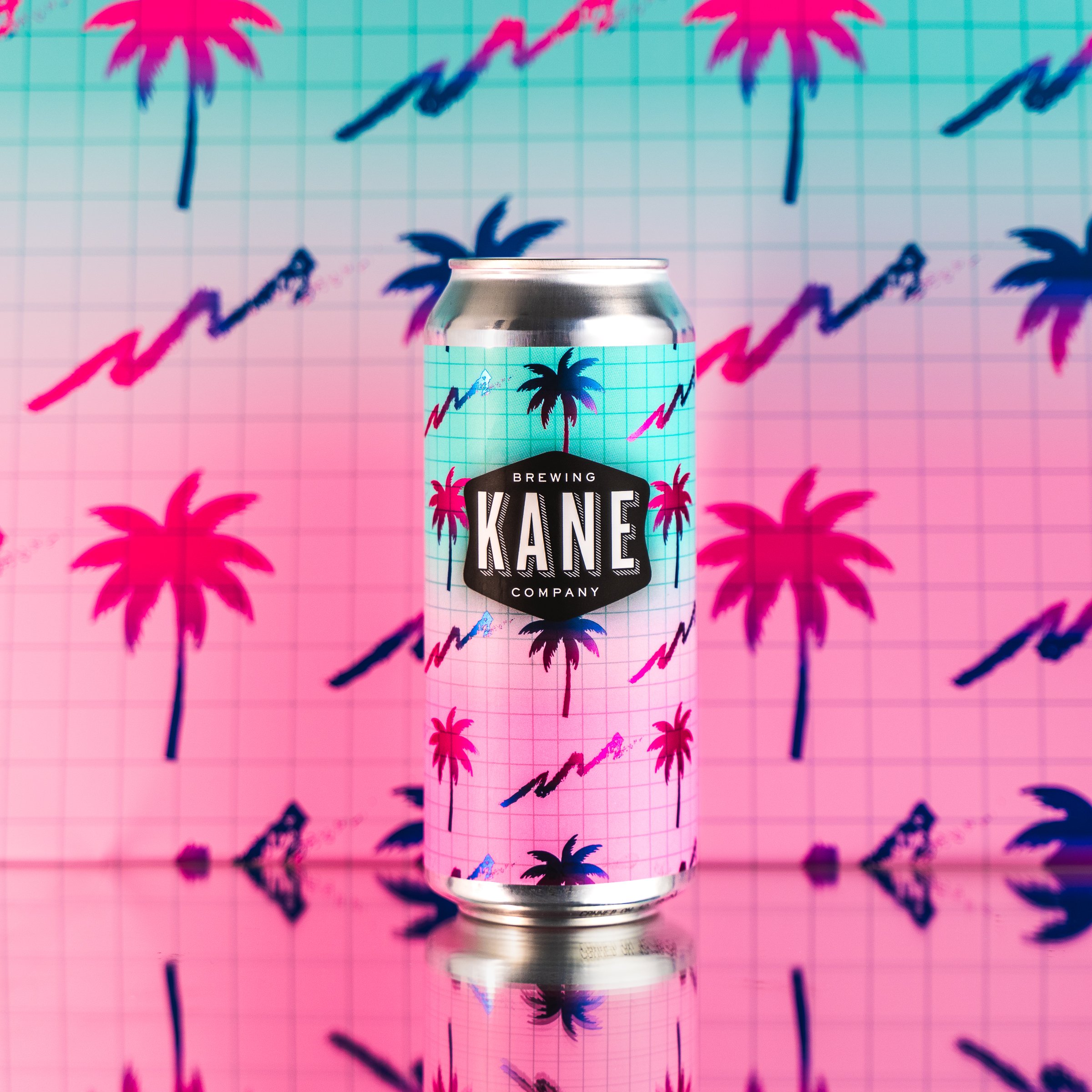
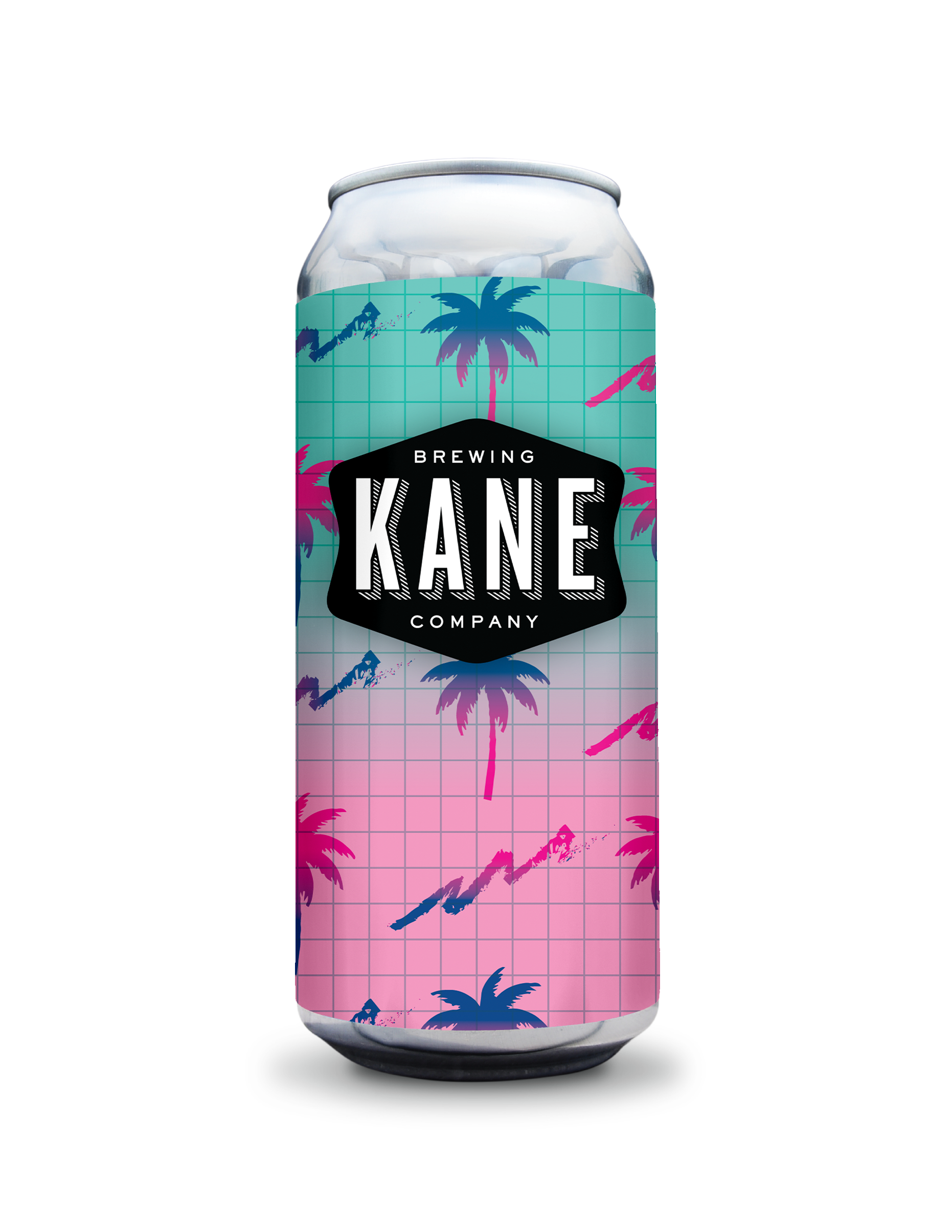
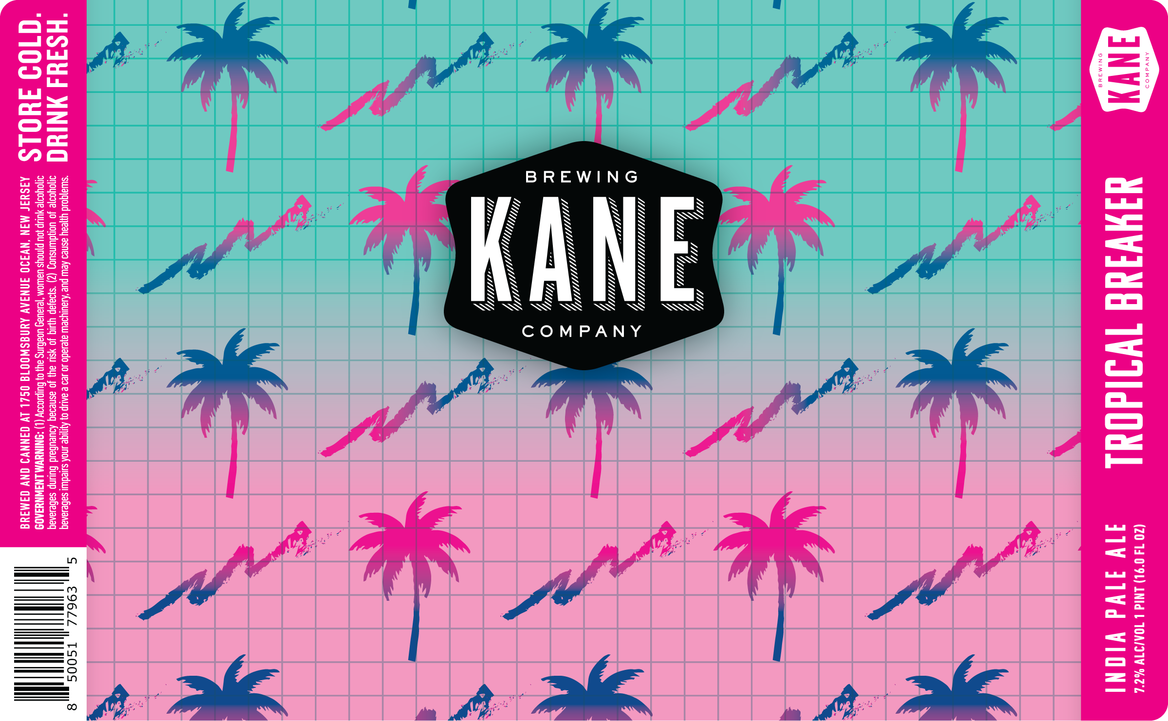
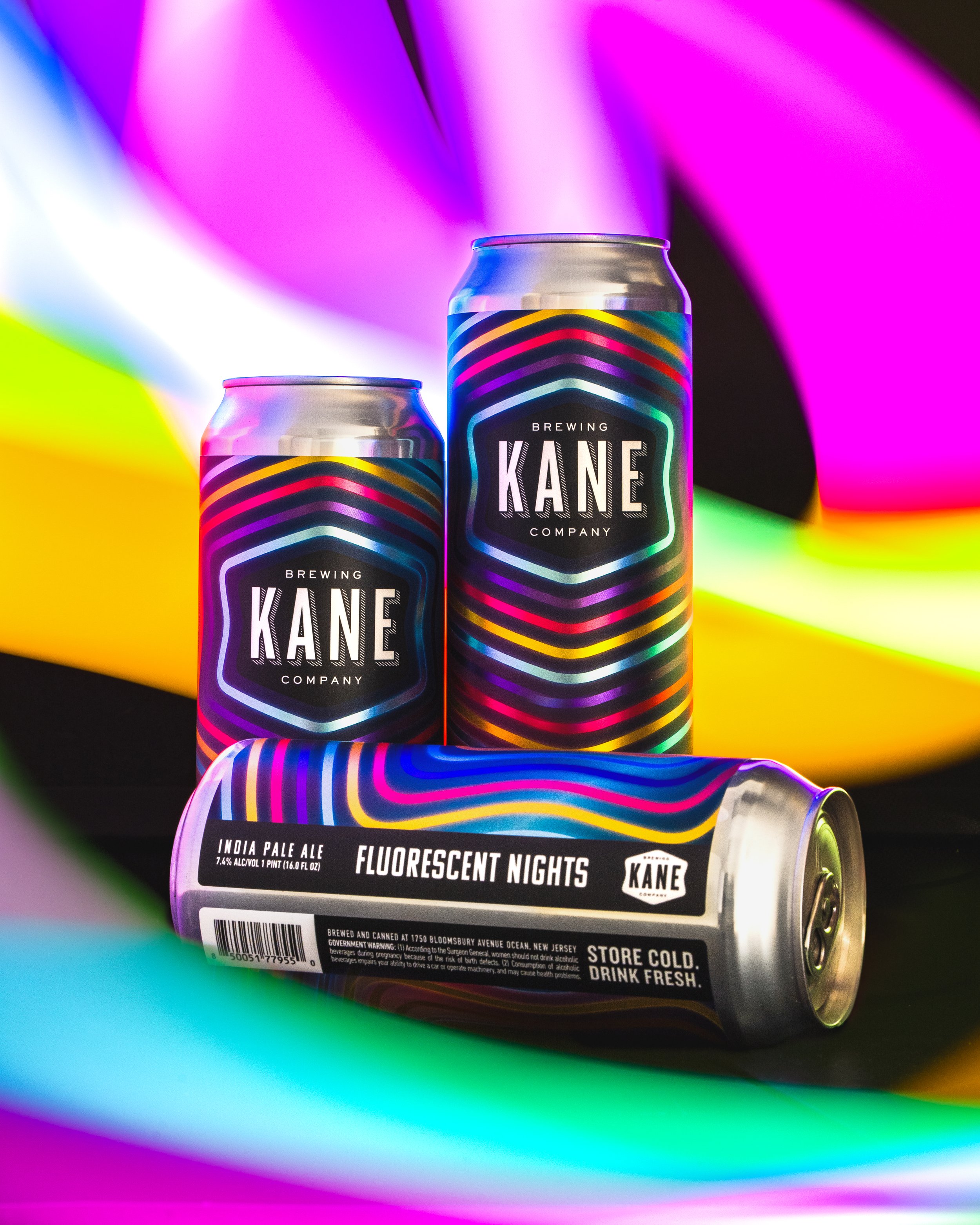
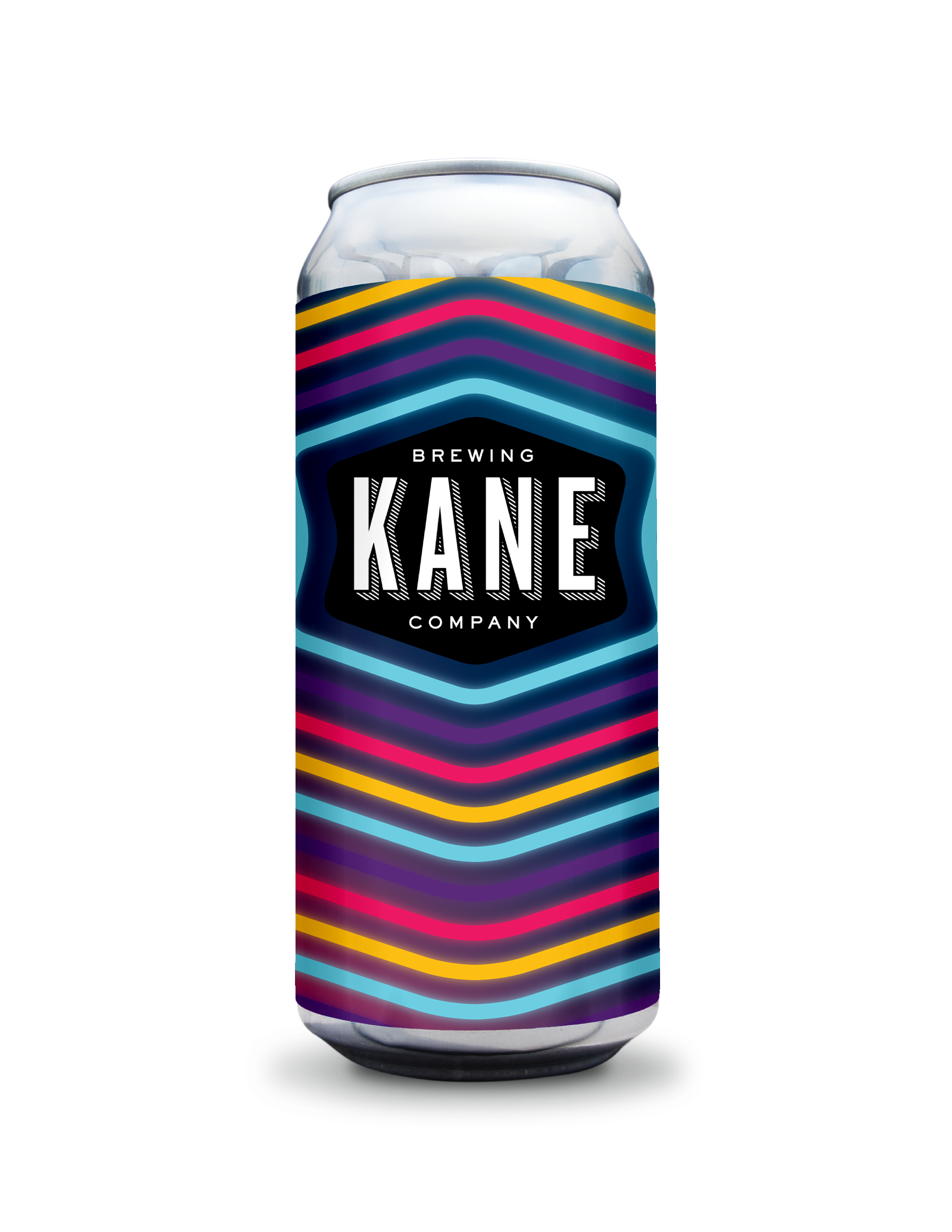
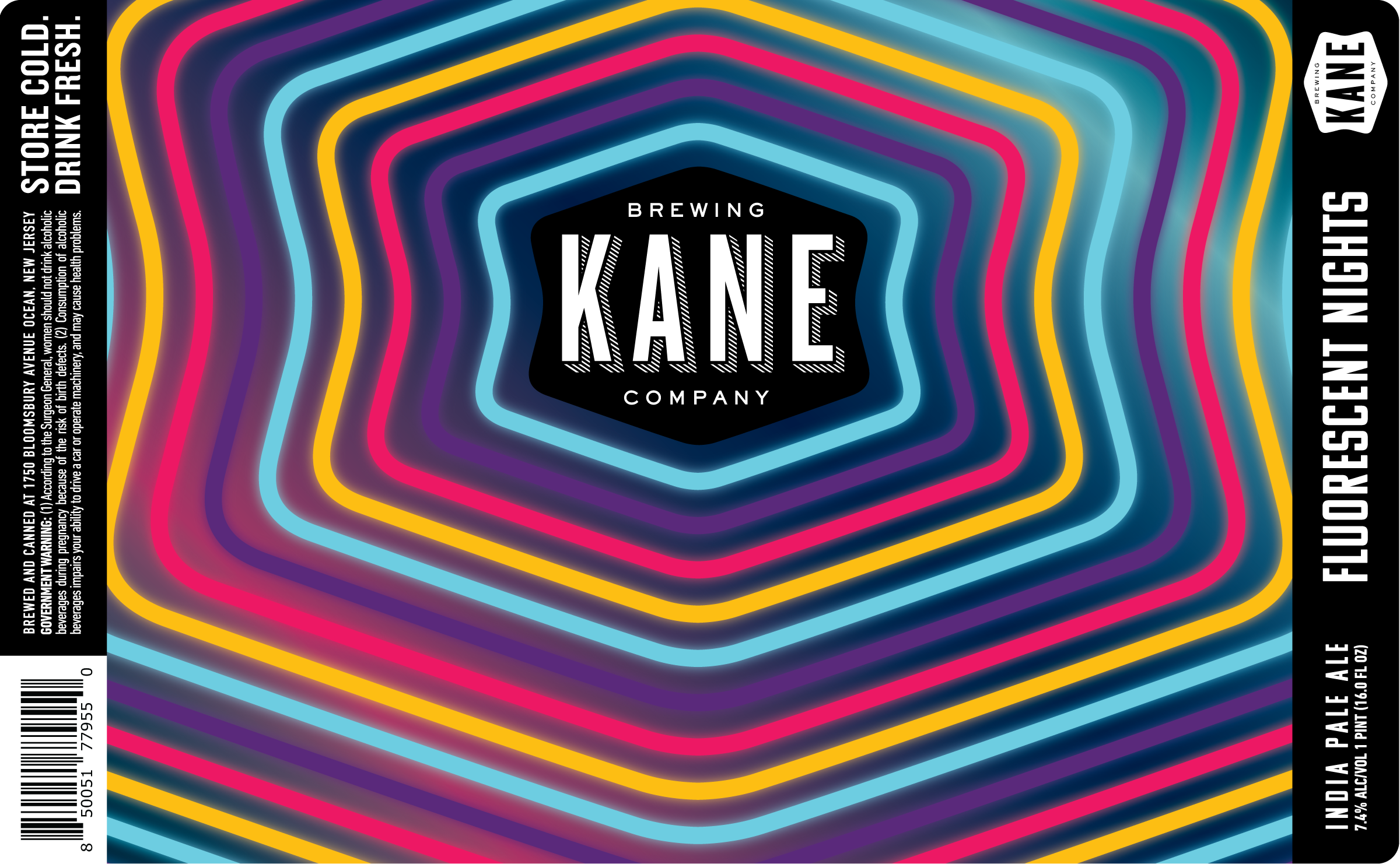
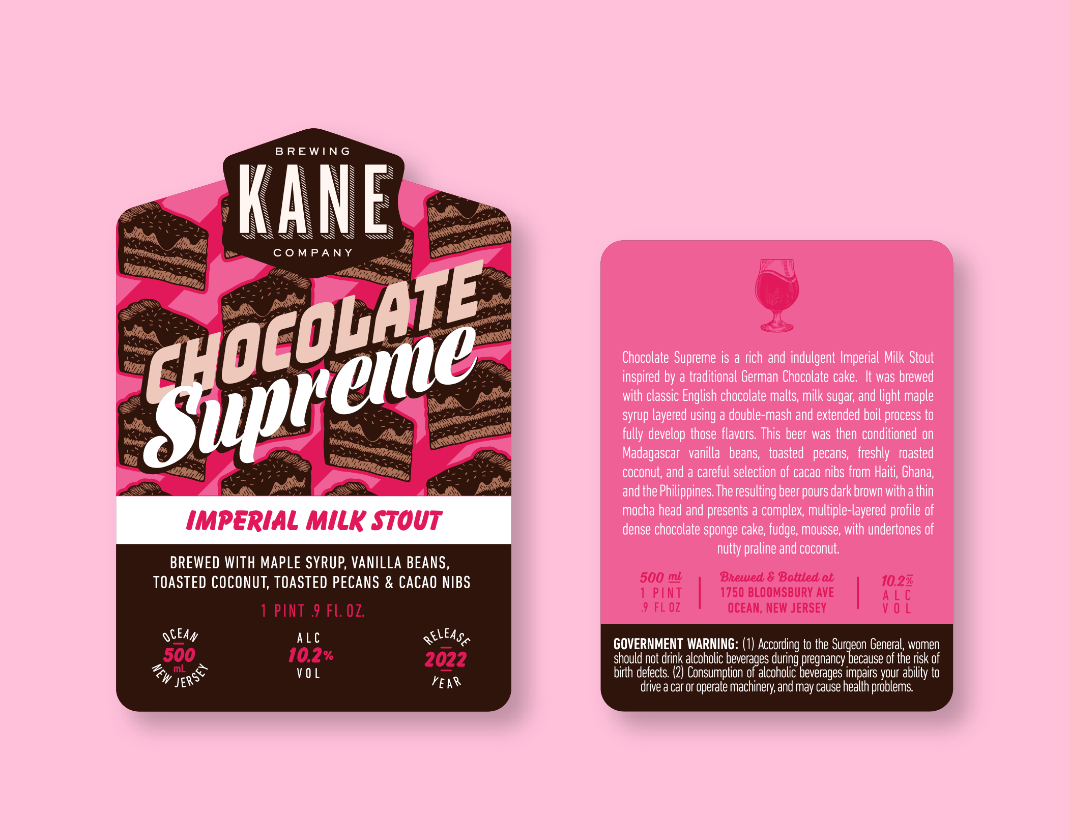
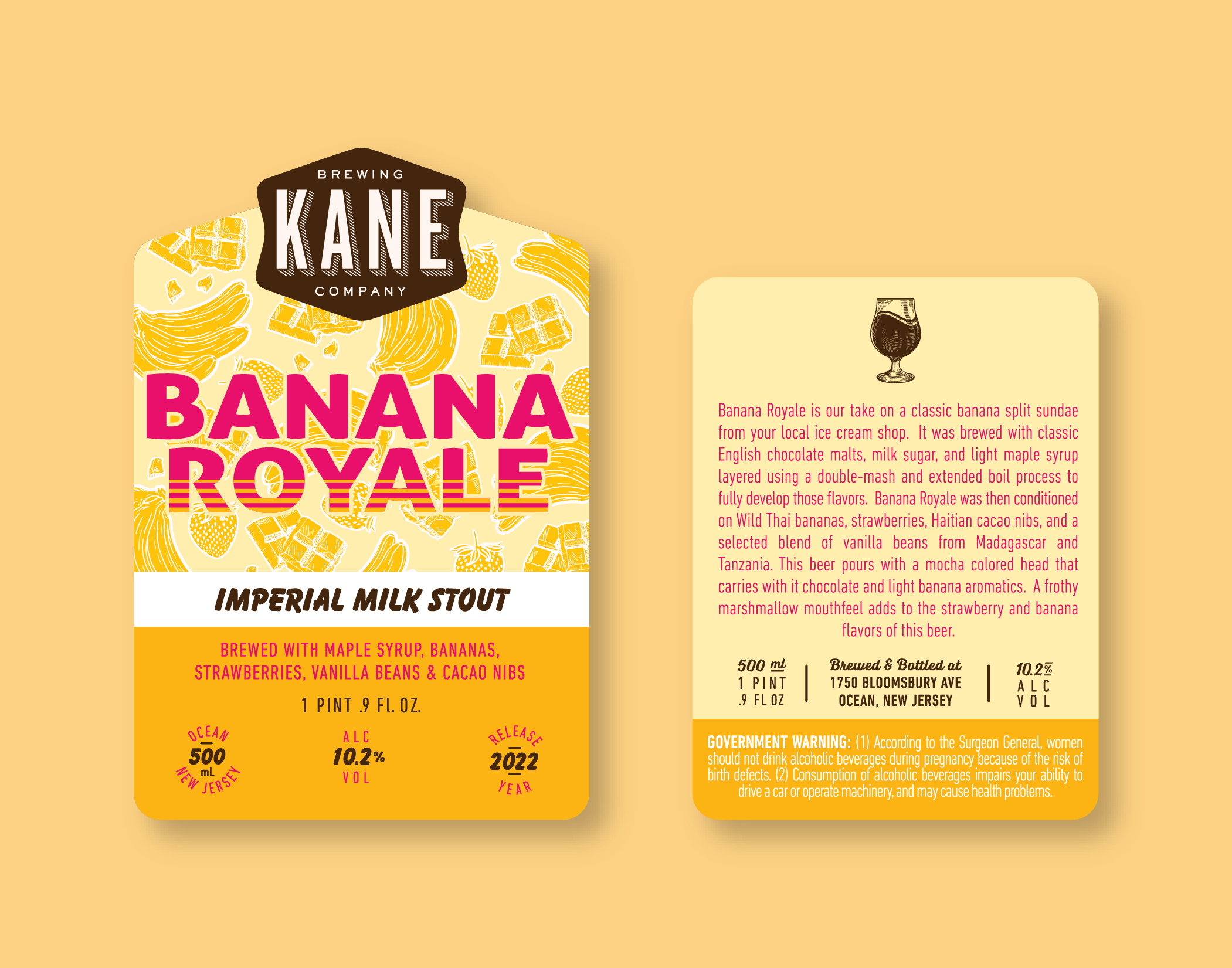
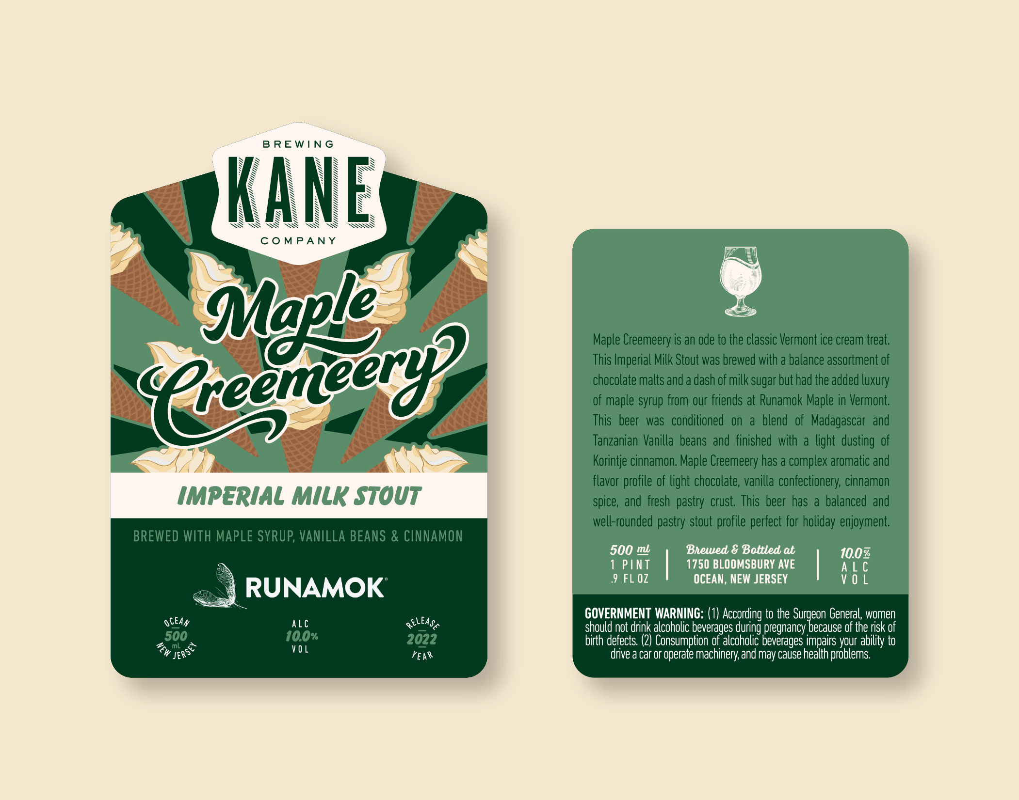
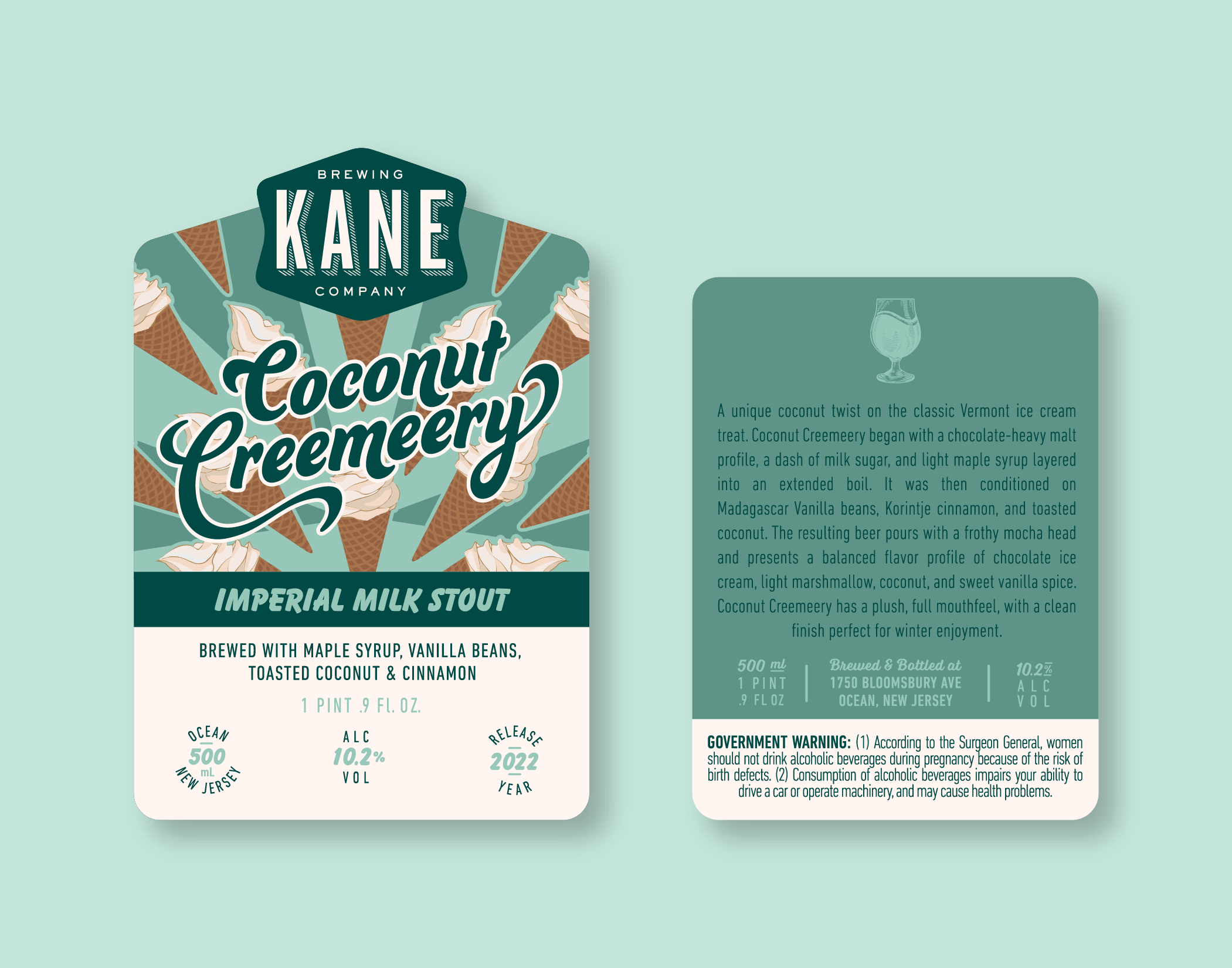
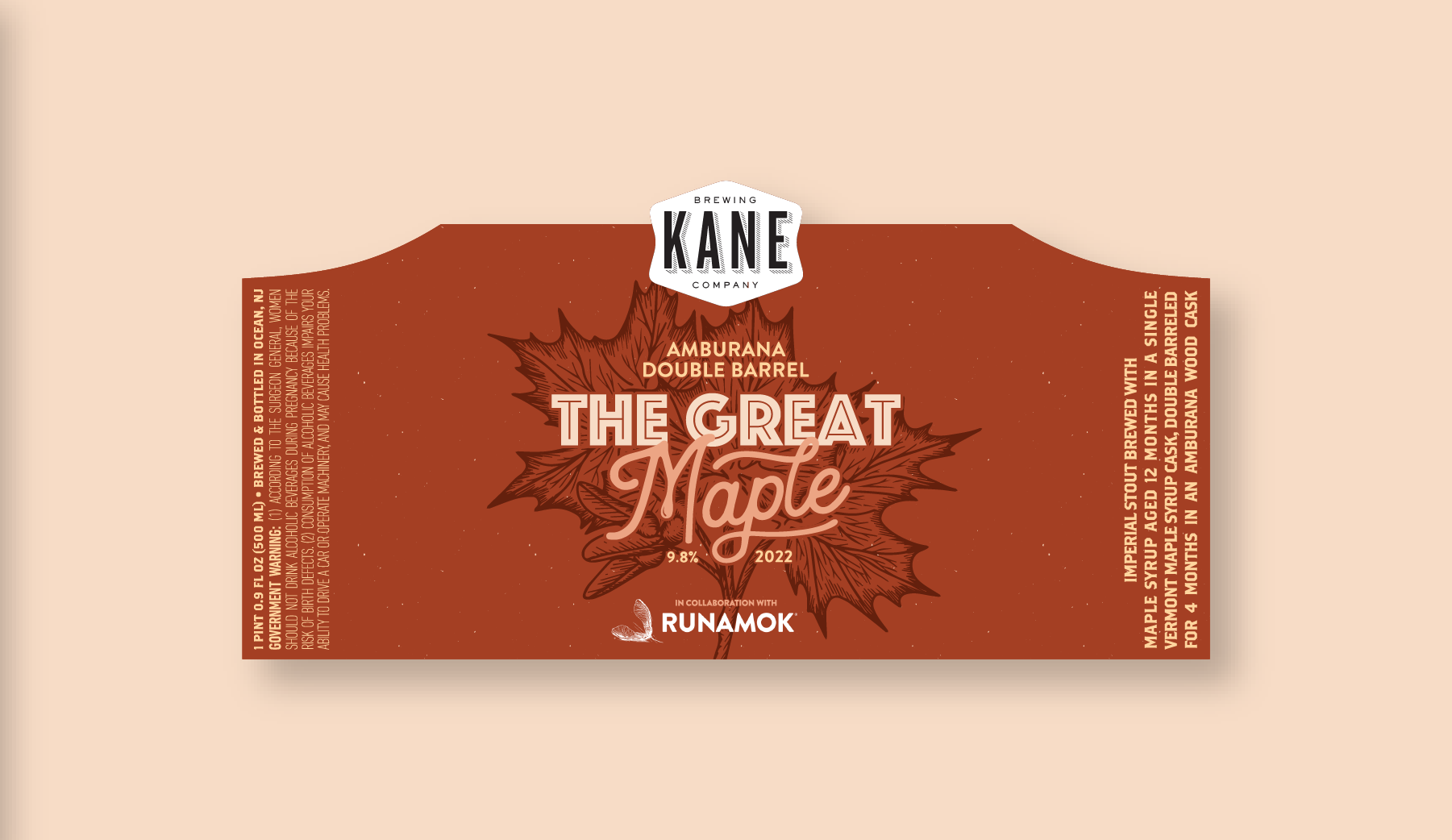
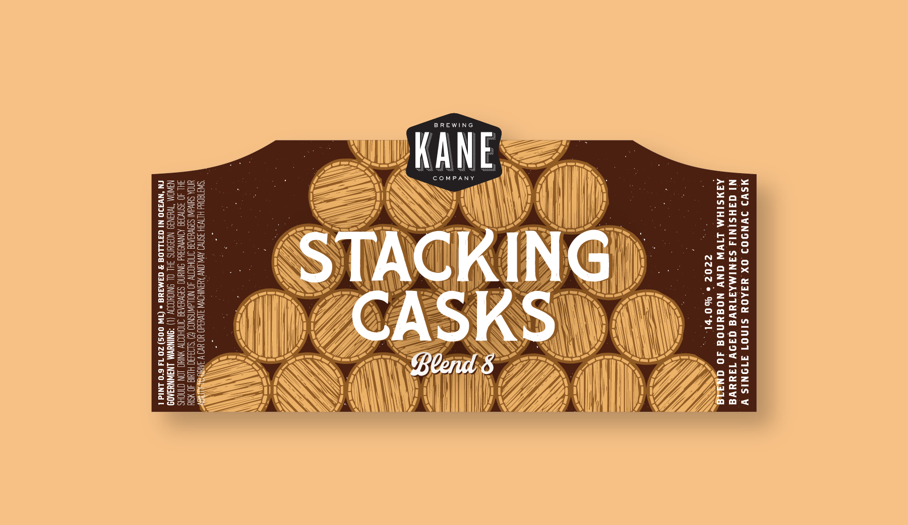
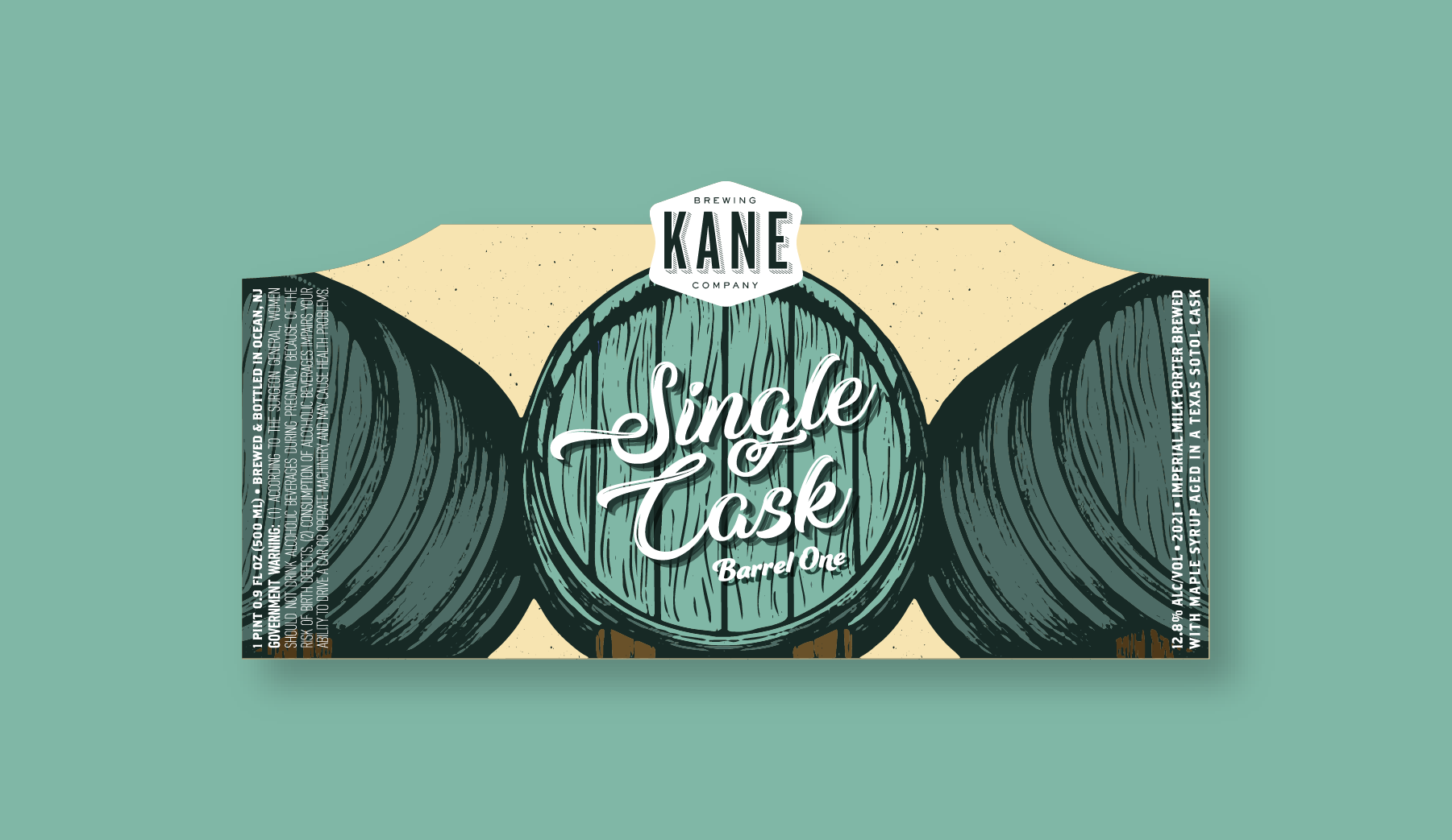
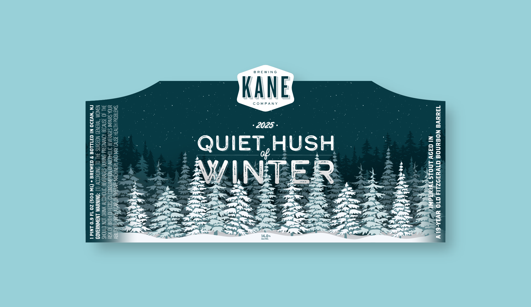
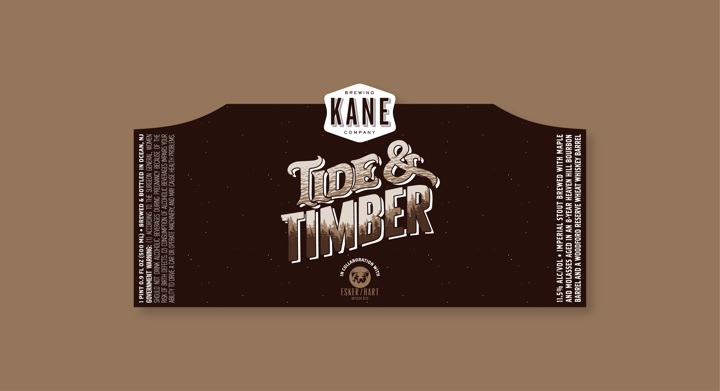
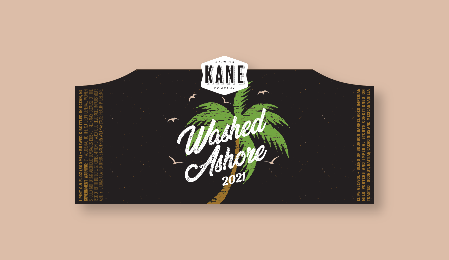
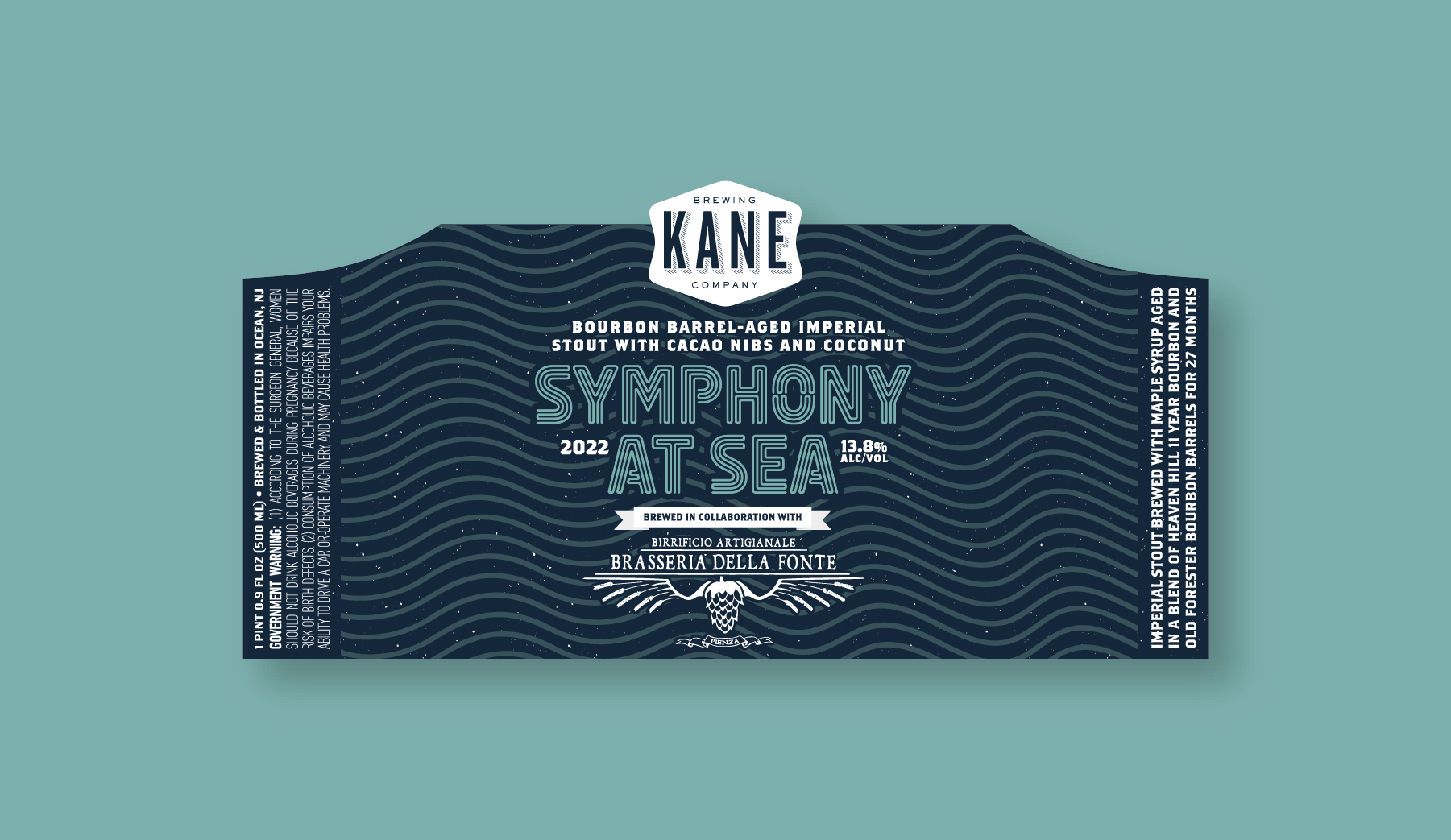
At Kane Brewing Company, Catie crafts labels that visually translate flavor profiles and themes, using bold and nuanced color palettes to evoke taste and experience.
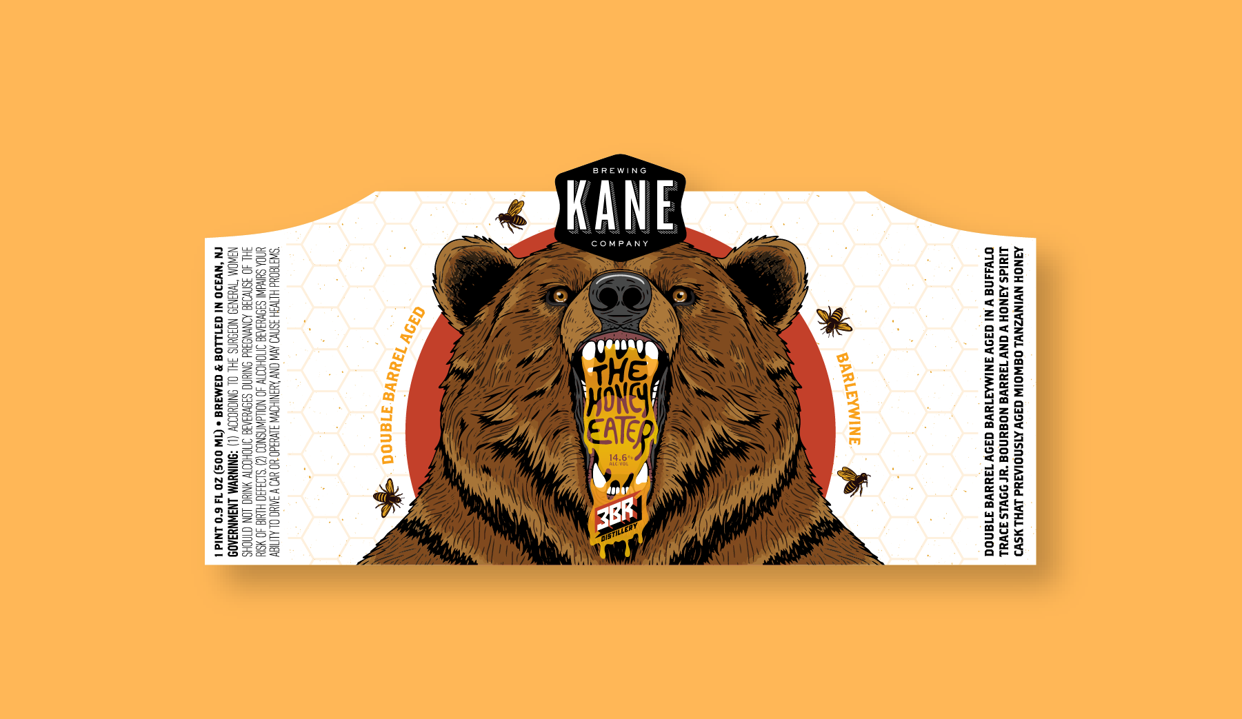
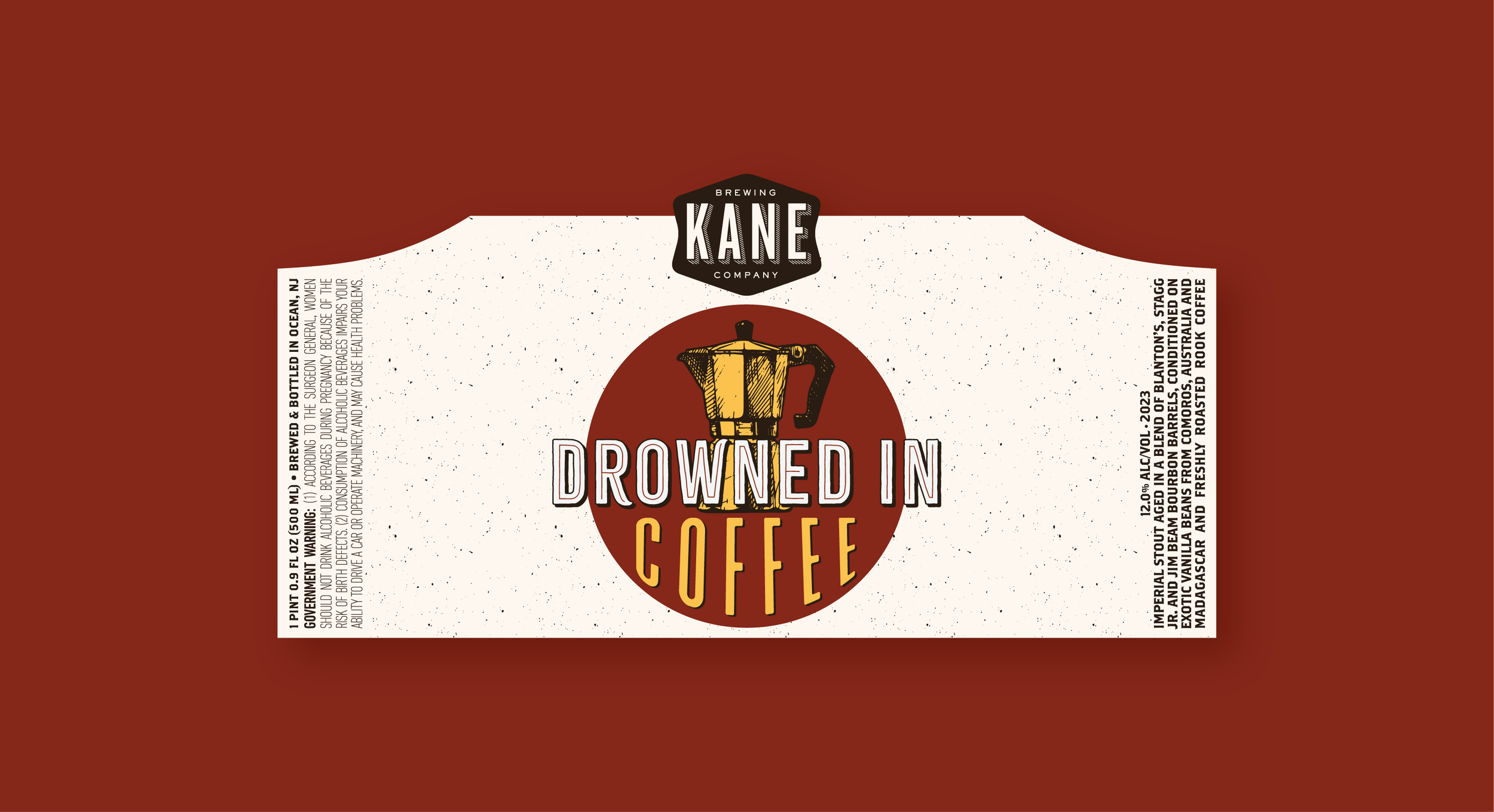
With barrel-aged and adjunct stouts, typography plays a key role in setting the tone—whether it’s modern and sleek or expressive and playful. The 16 oz. can labels incorporate themed patterns, textures, and even recognizable locations, adding depth to each design. Every label is an opportunity to create a visual identity that enhances the beer inside, making each release feel distinct and memorable.