From logo creation and visual identities to real examples, Catie aims to build cohesive and memorable brands!
Nourish Blossom Farms
Crafting an Identity Rooted in Nature
Overview:
The client requested a block-print style logo that incorporated the specific plants used in her products. The brand needed to feel organic yet structured, with a color palette inspired by nature—bright, vivid, and warm. Additionally, she needed custom iconography representing farming tools for her website and packaging.
Challenge:
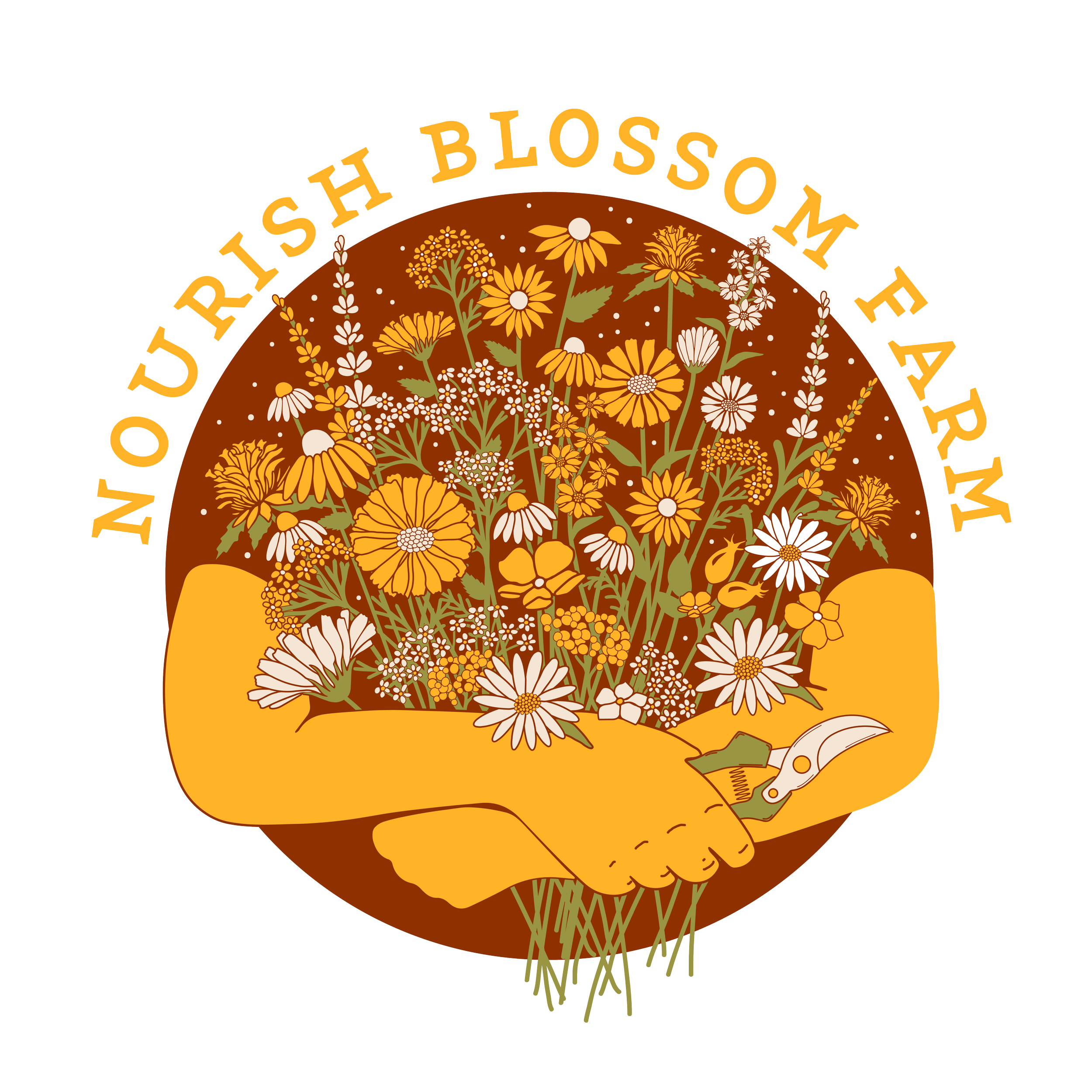
Nourish Blossom Farms is a woman-owned small farm that grows its own produce and flowers to create wellness products like tinctures, salves, and lotions. The client wanted a brand identity that reflected the natural ingredients she cultivates daily.
Solution:
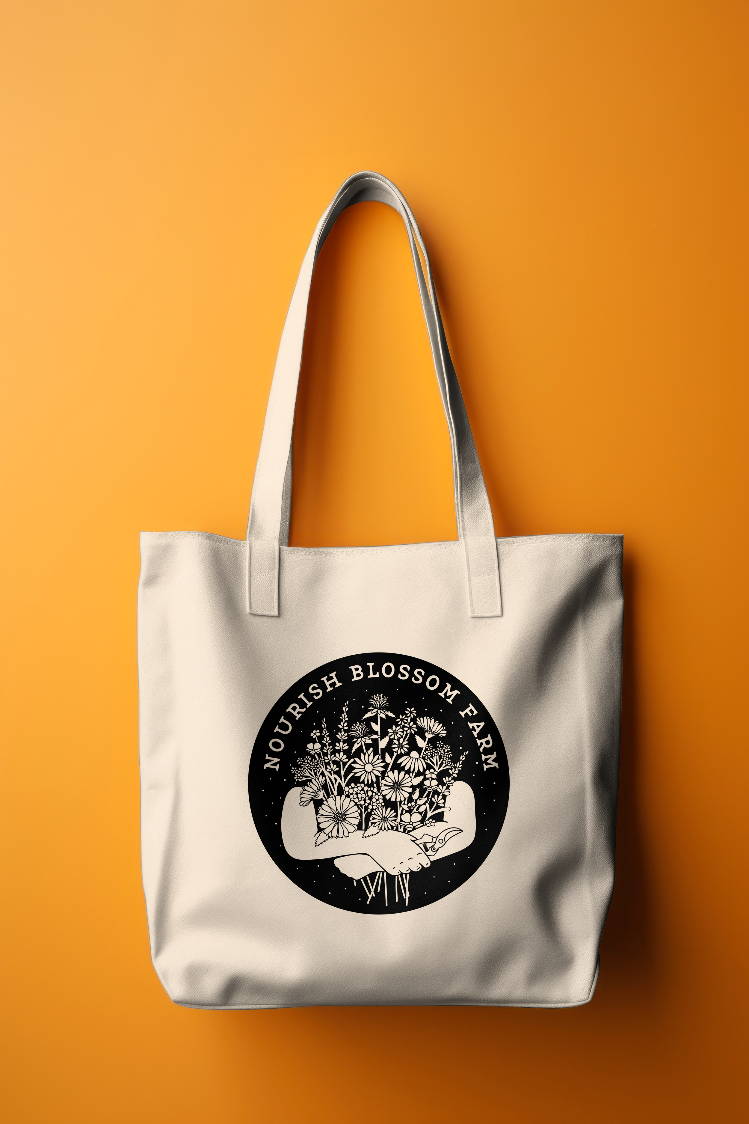
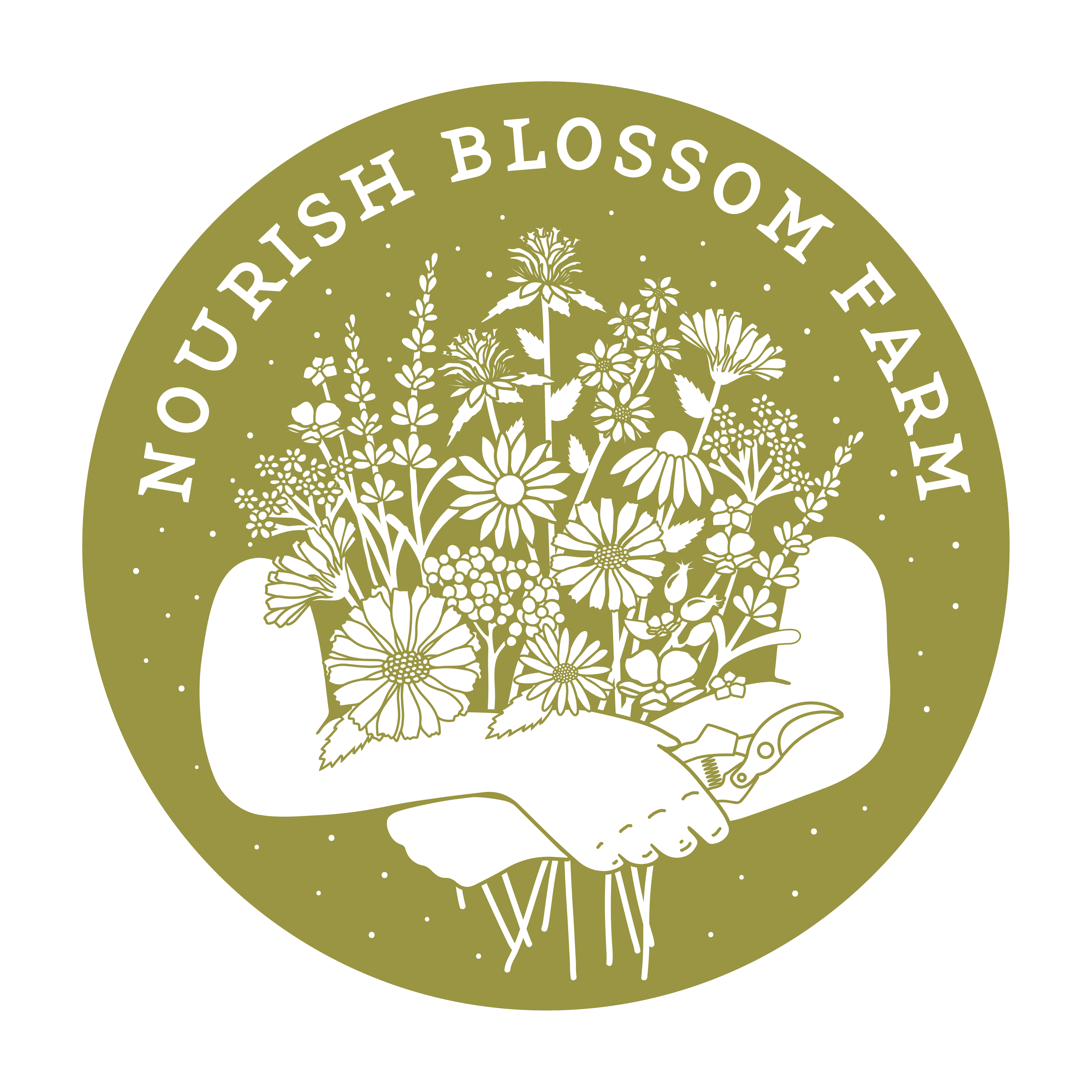
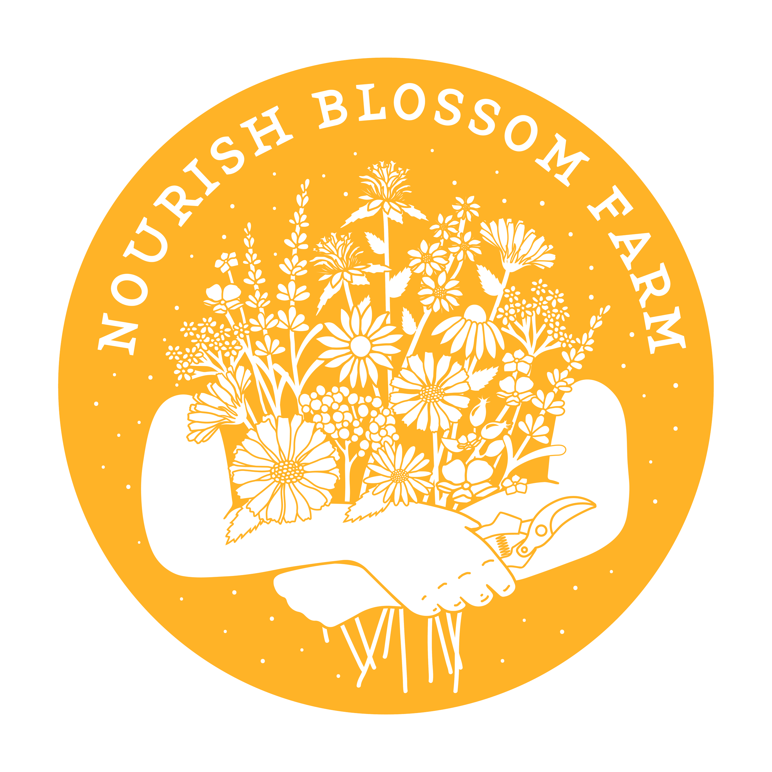
I designed a logo with the distinctive look and texture of a woodcut block print, featuring rough, organic edges and bold yet simple shapes. The composition was inspired by a photo of the client holding a bouquet, incorporating key flowers found in her tinctures and salves. The four-color palette was drawn from natural elements but kept vibrant and welcoming.
Beyond the primary logo, I created a series of hand-drawn farm tool icons to complement the brand identity across digital and print applications. The goal was to eventually translate the logo into a hand-cut stamp, reinforcing the handmade, small-batch nature of the brand.
Impact:
The final branding authentically represents Nourish Blossom Farms’ dedication to handcrafted wellness products. With a logo that captures both personal and botanical significance, the brand now has a visual identity that feels timeless, artisanal, and deeply connected to nature.
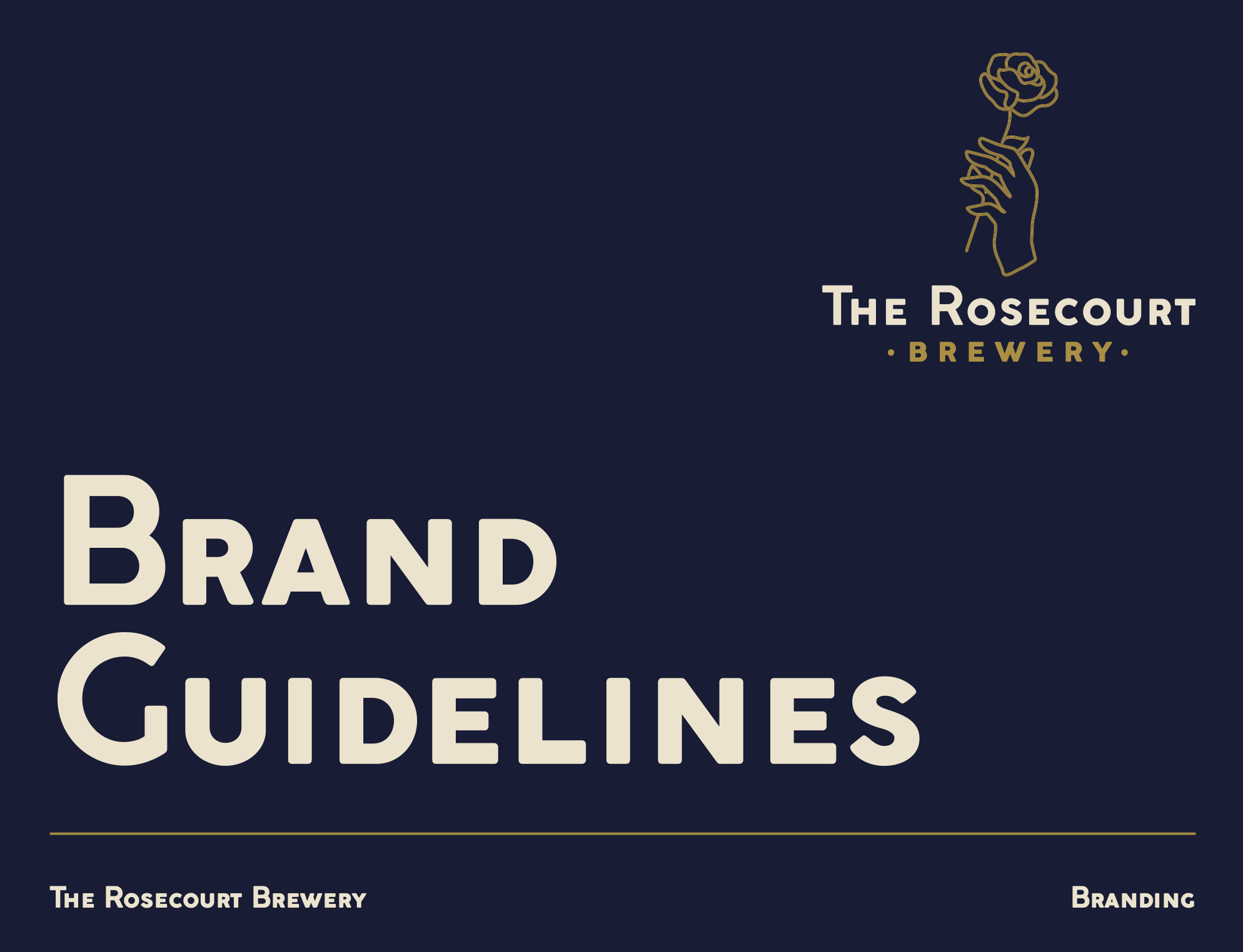
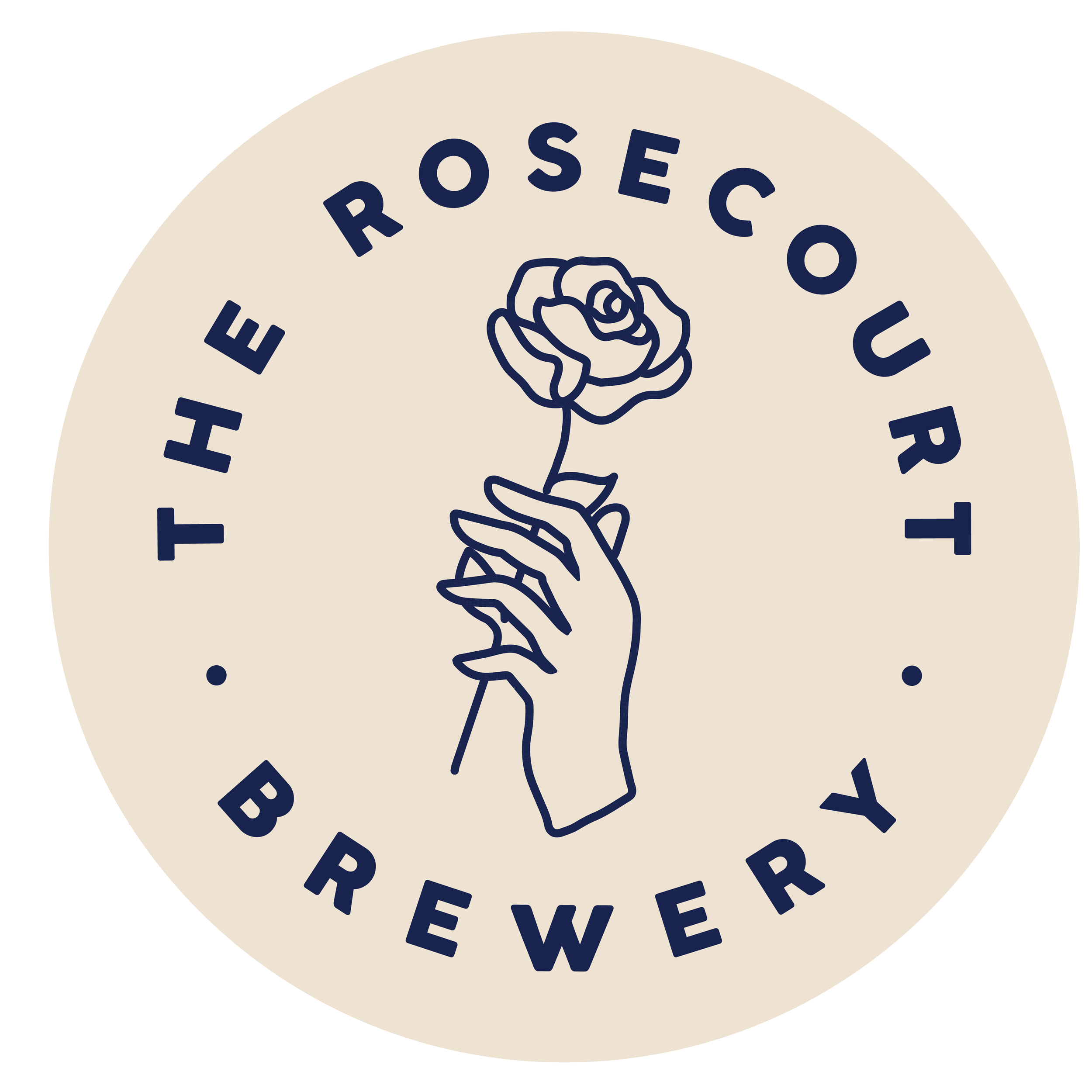
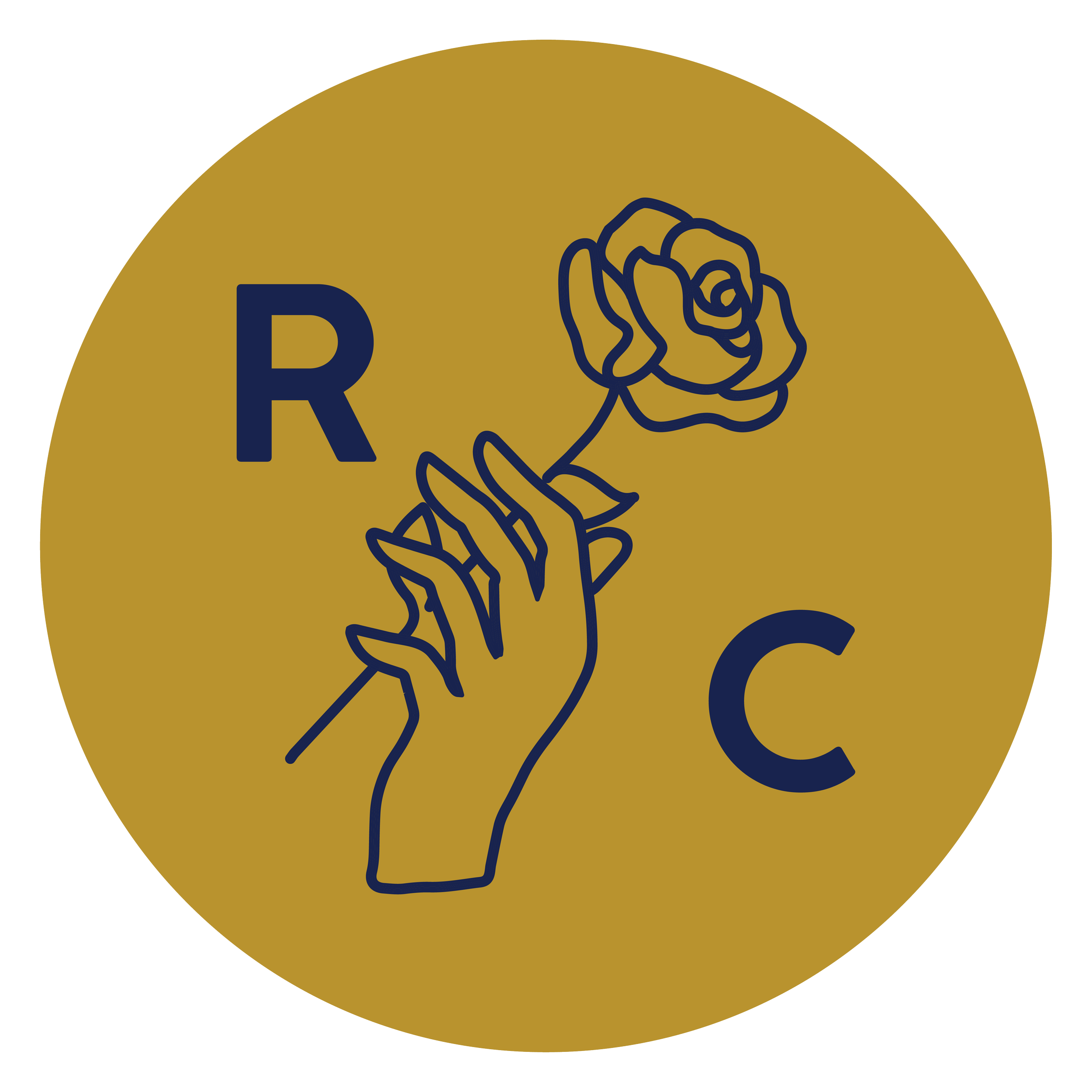
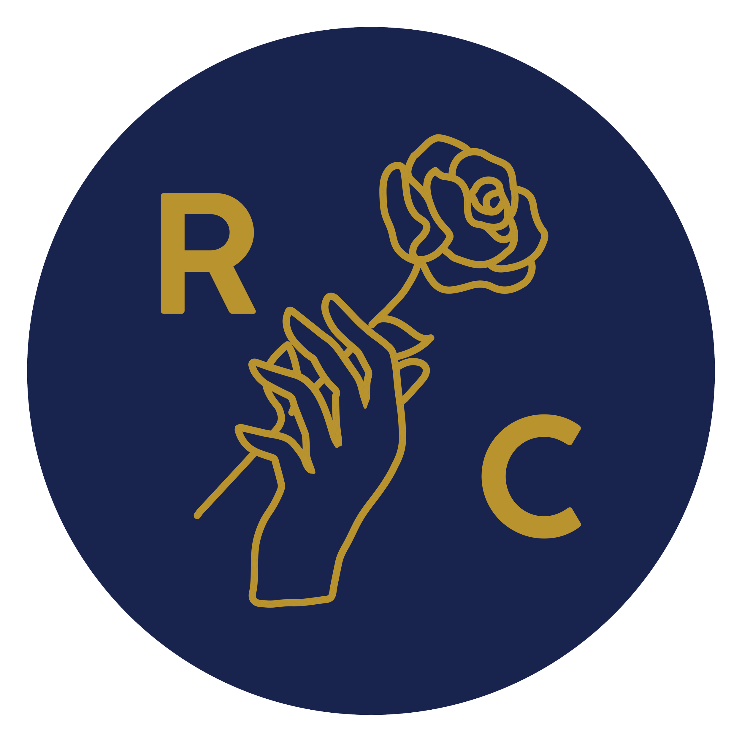
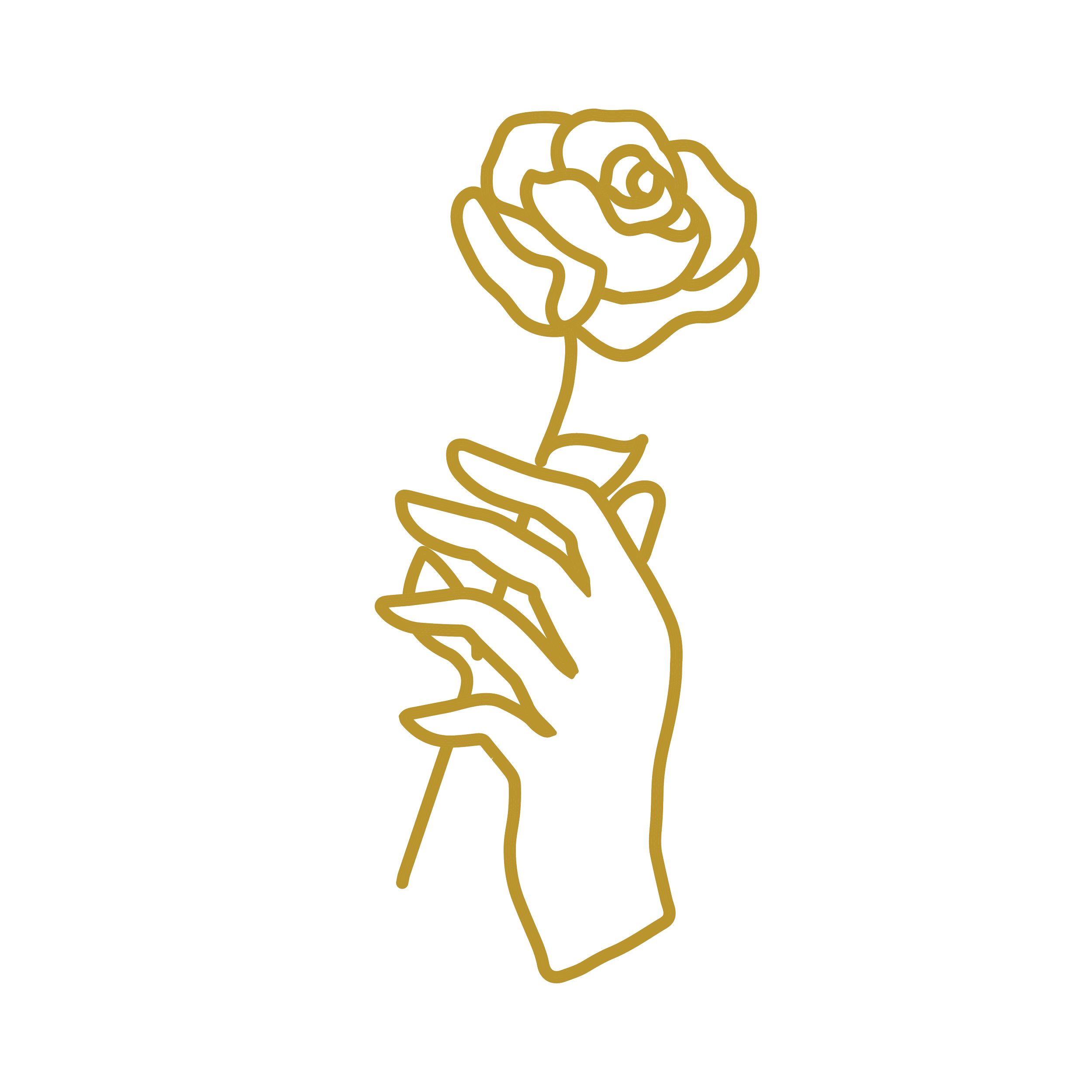
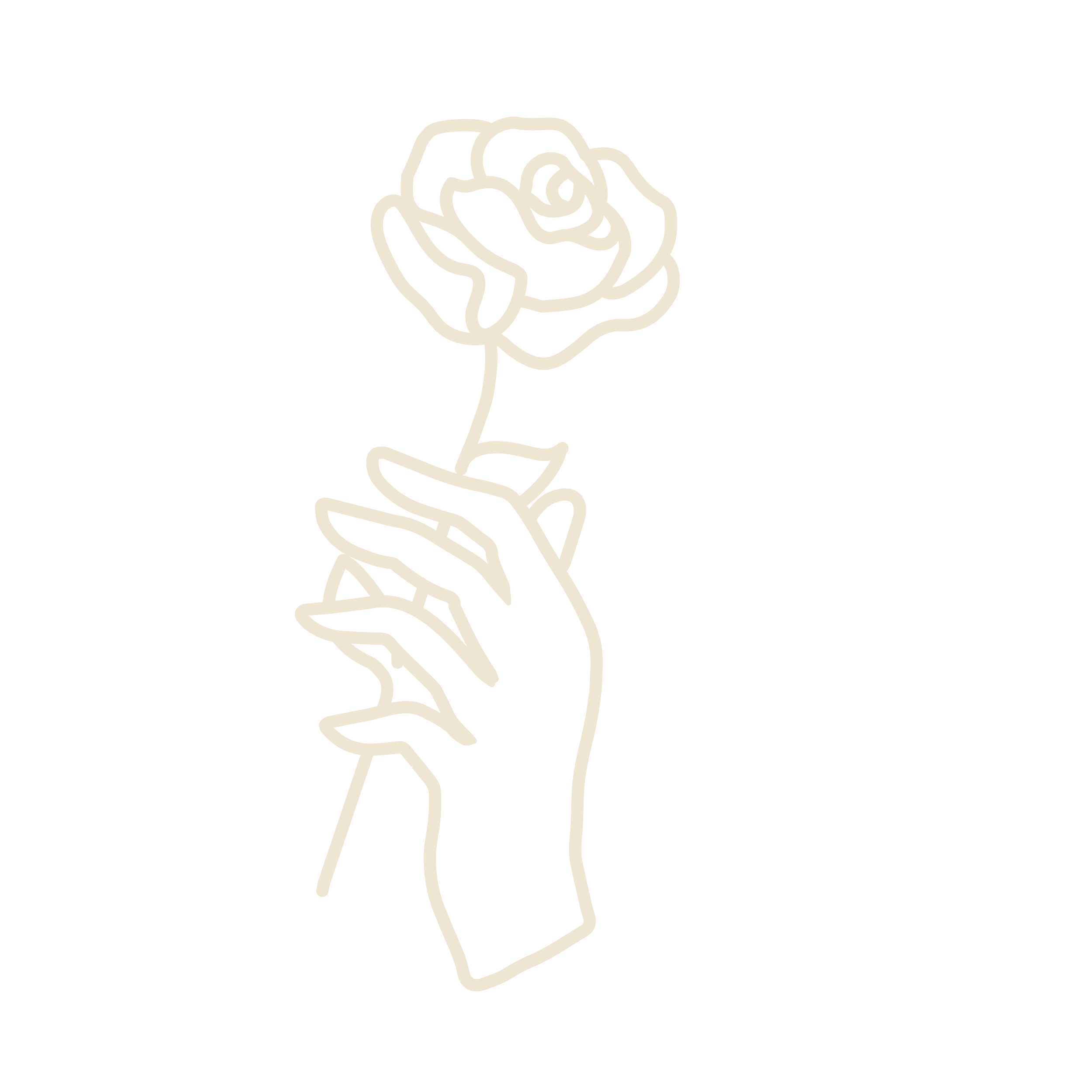
The Rosecourt Brewery
Merging Tradition with Modern Minimalism
Overview:
The Rosecourt Brewery is a family-owned brewery focused on taproom-exclusive offerings. Their brewing process emphasizes traditional methods, including the use of a coolship for both lagers and spontaneous fermentation.
Challenge:
The client wanted a clean, minimalist logo inspired by European brewing traditions—without relying on common beer-related imagery like hops or malt. The design needed to subtly reference the brand’s name while ensuring it felt timeless, sophisticated, and versatile across all branding materials.
Solution:
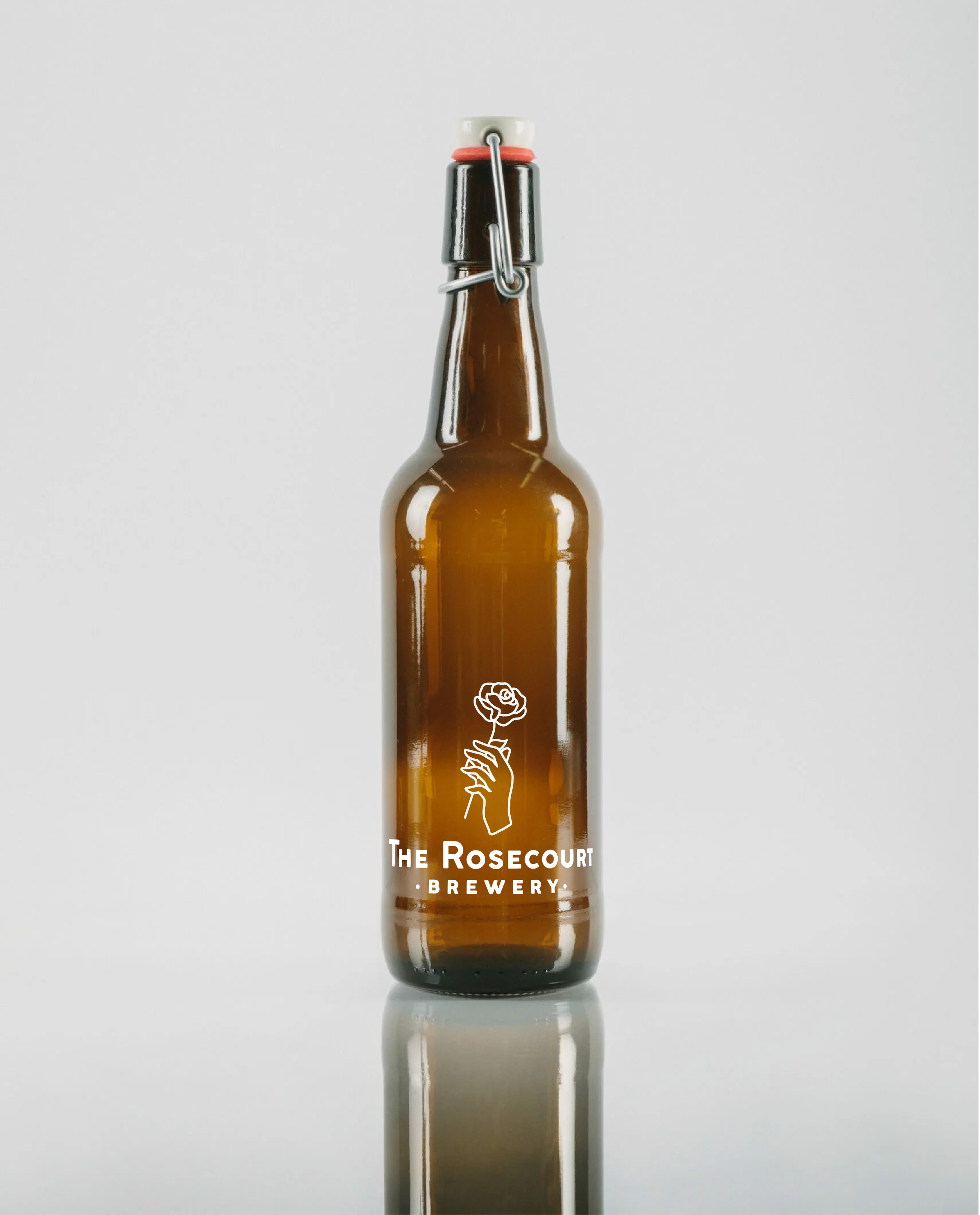
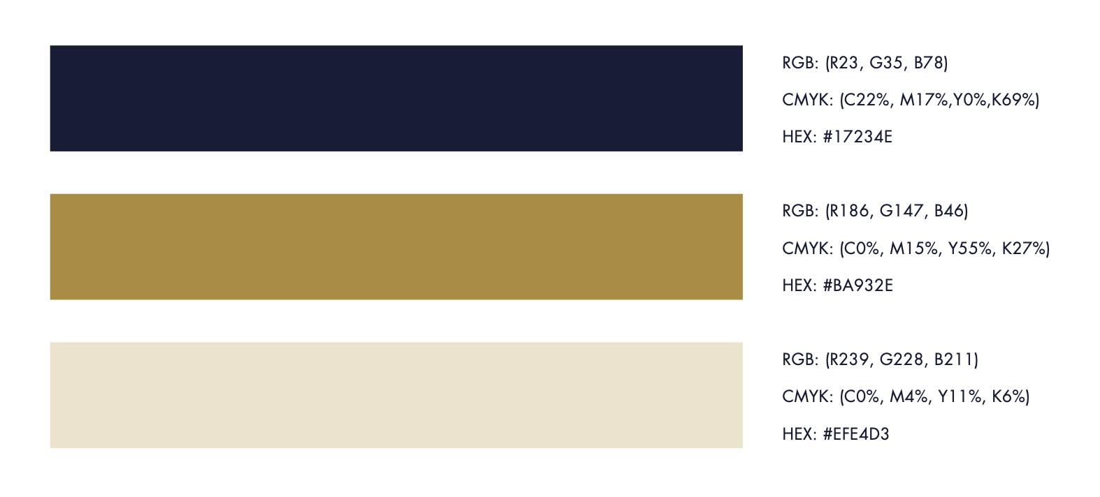
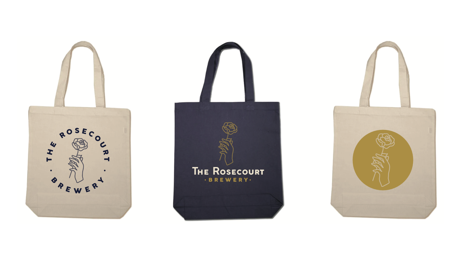
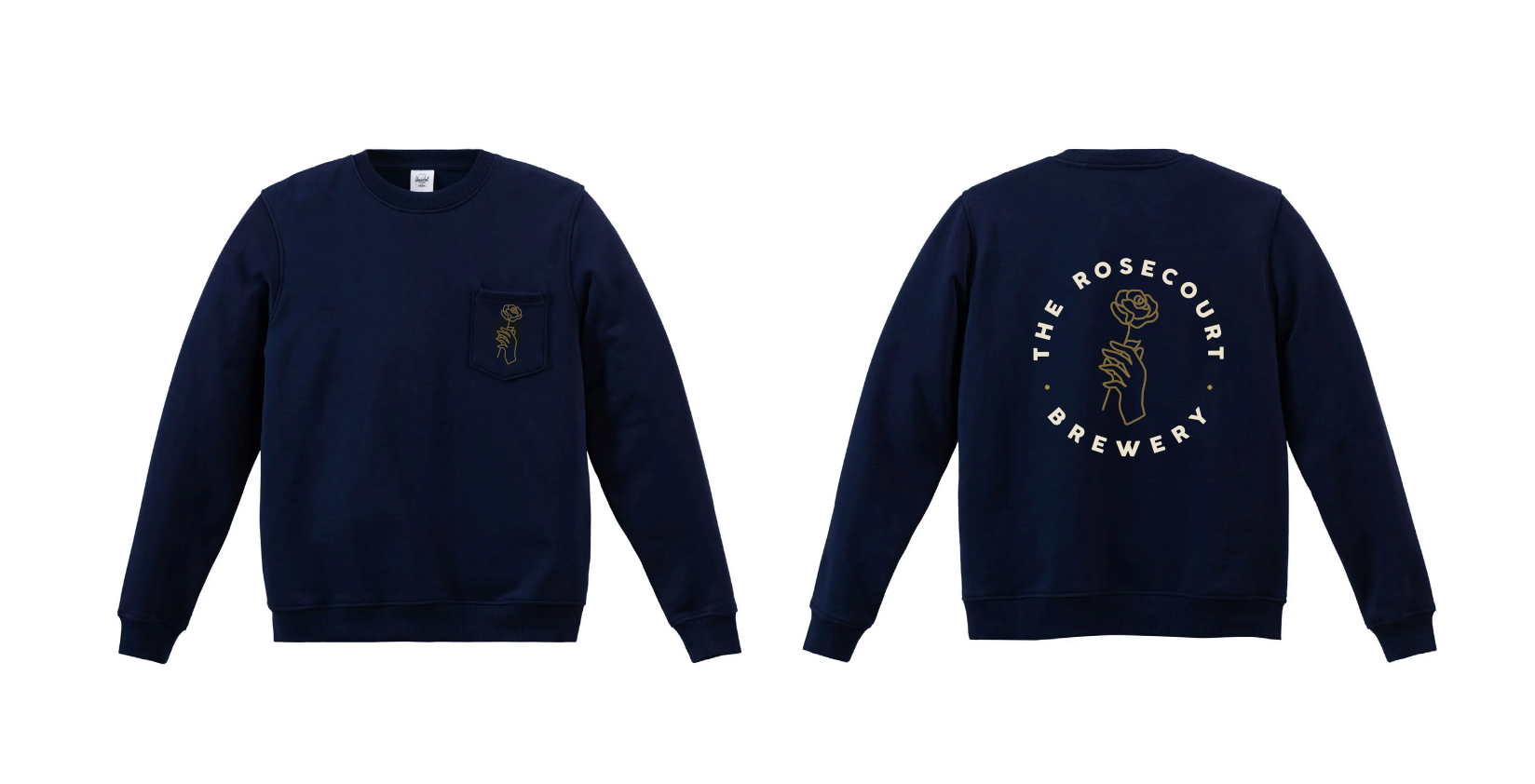
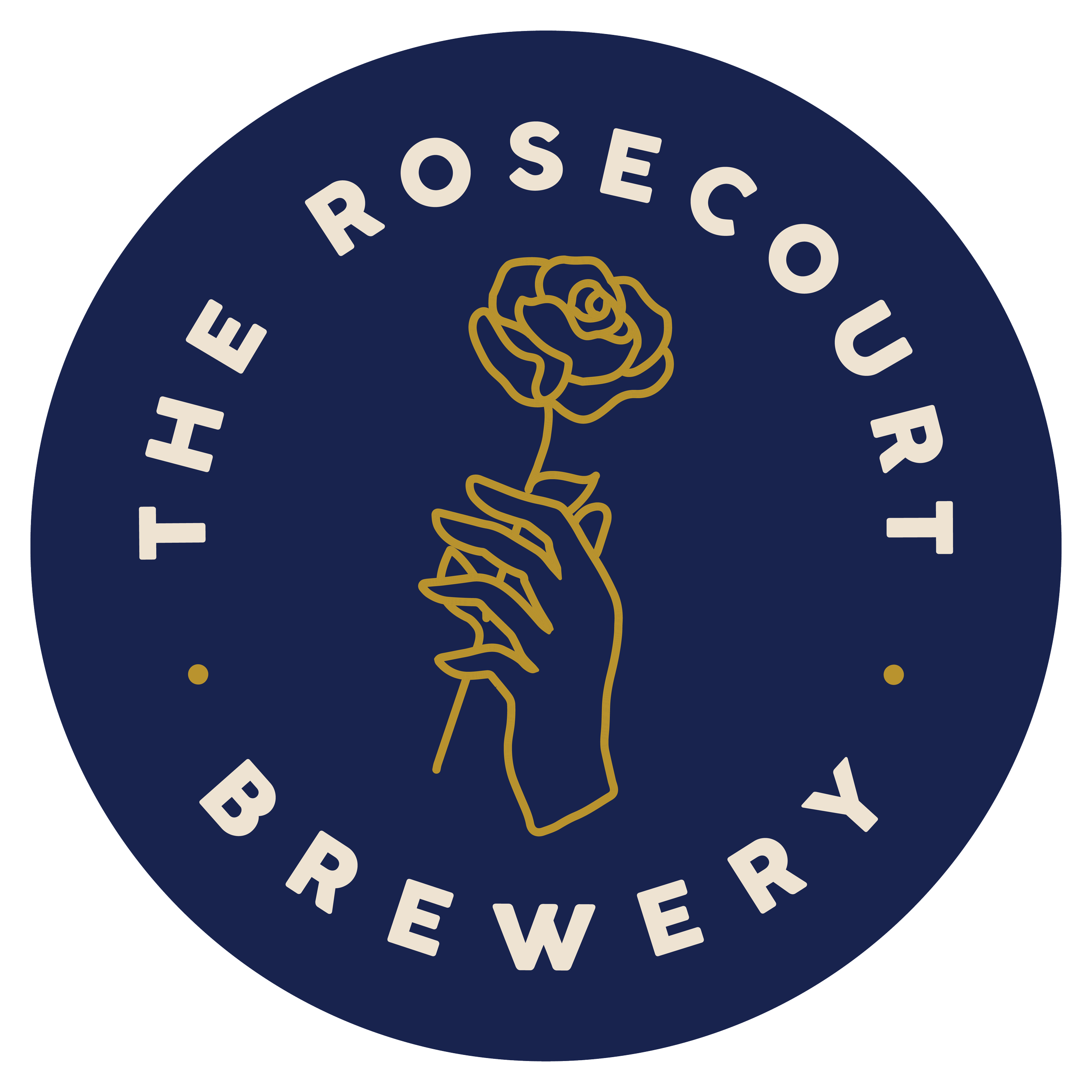
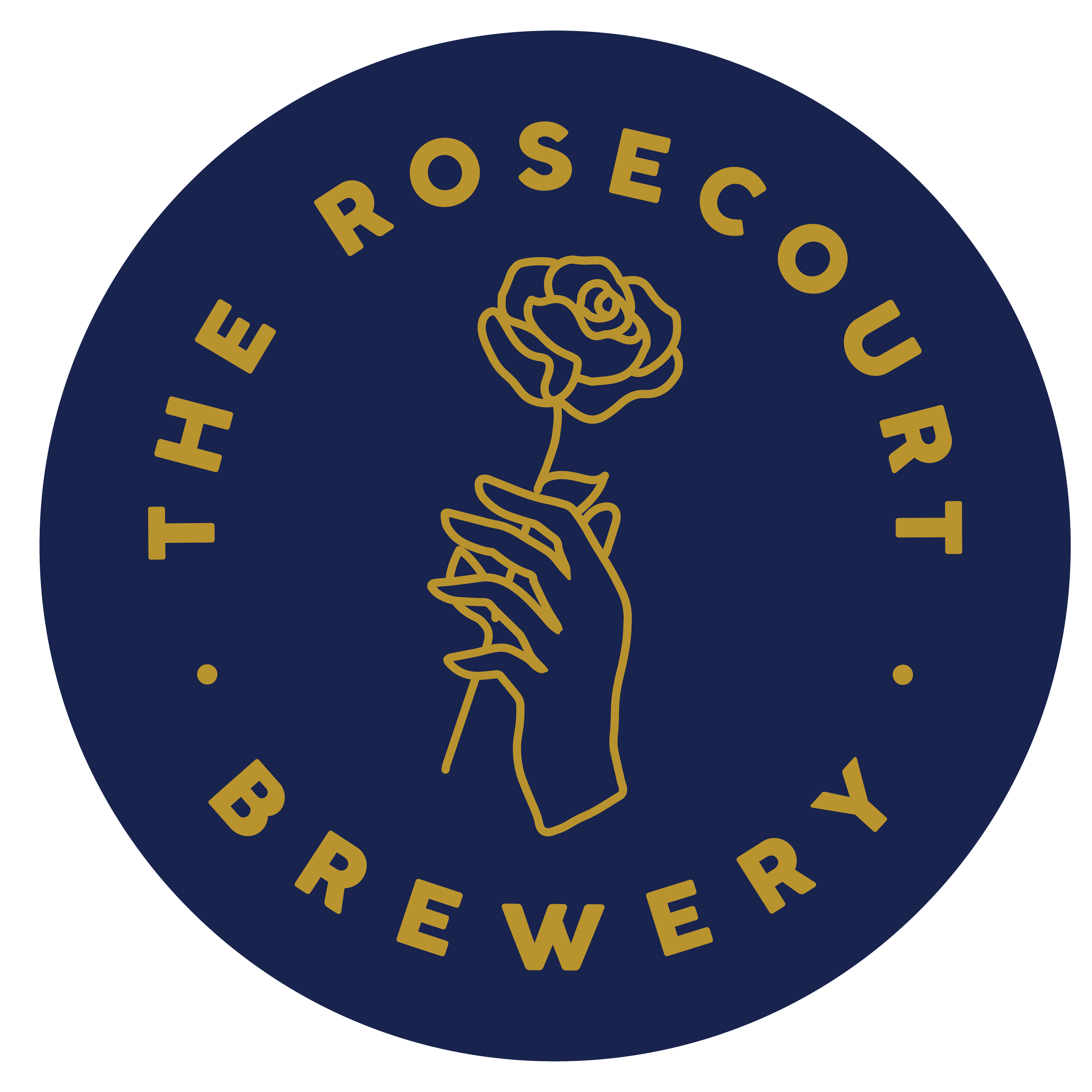
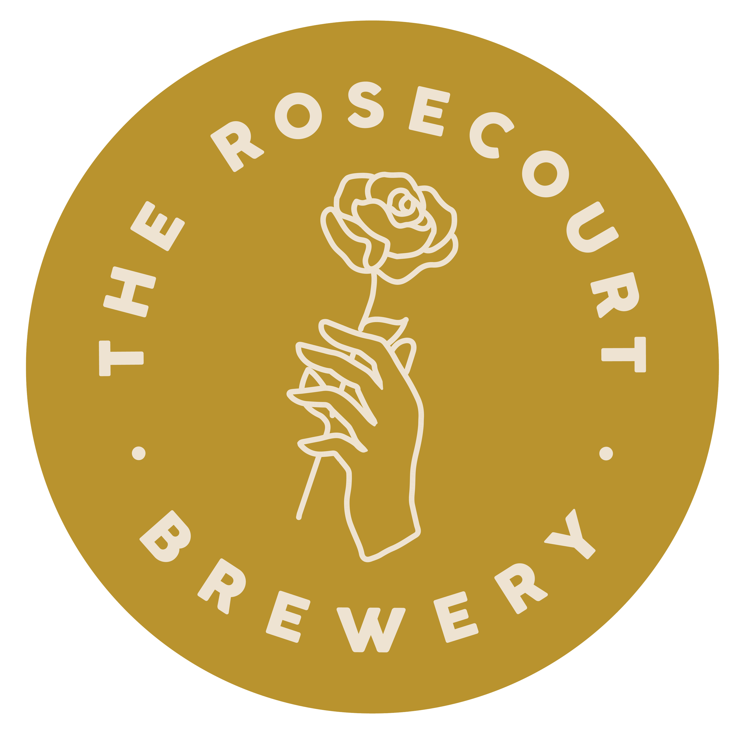
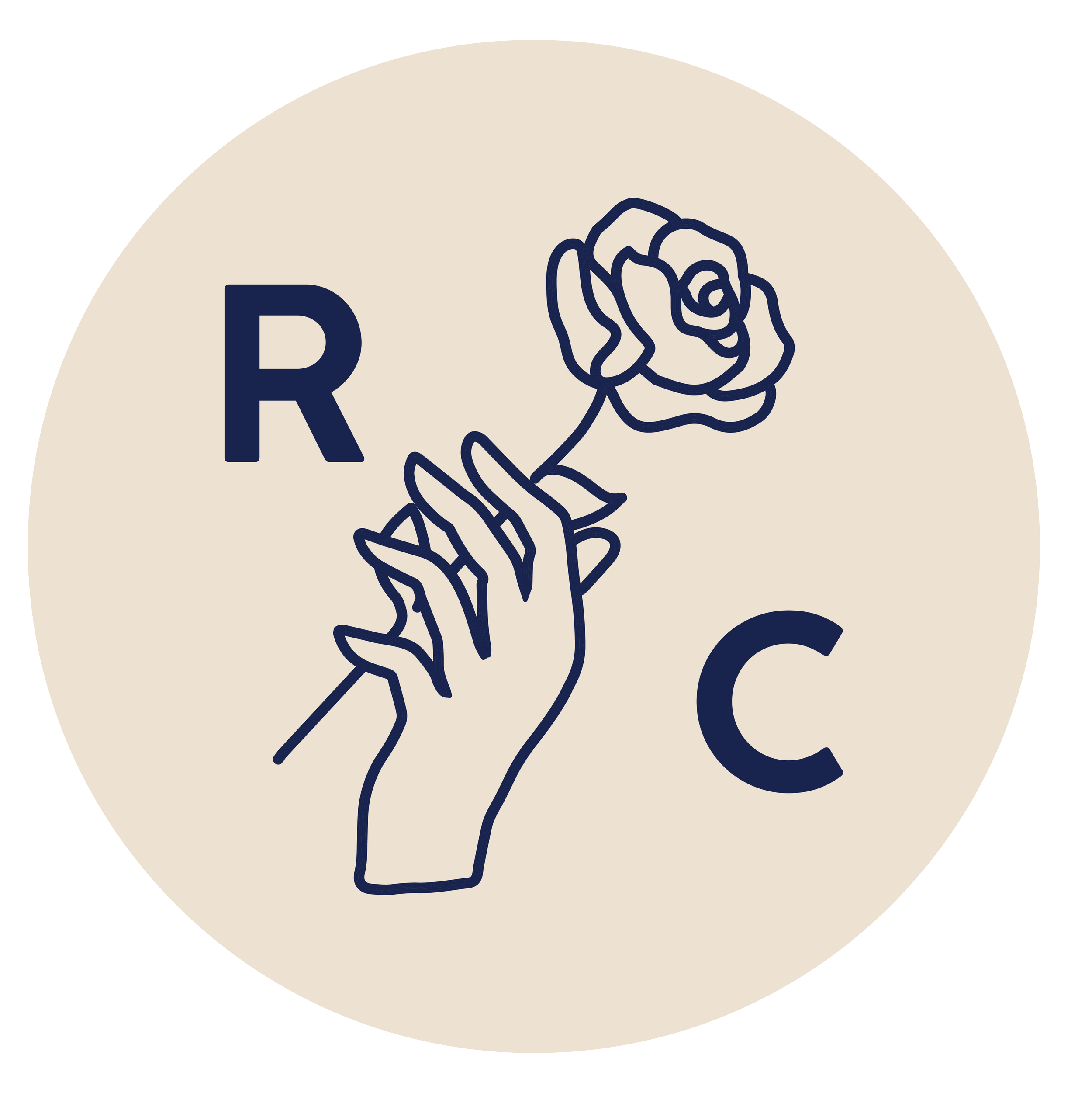
For the final logo, a simple yet elegant hand-and-rose icon, symbolizing both tradition and craftsmanship was created. The visual style draws from historical European brewery aesthetics while maintaining a refined modern sensibility. A deep navy and gold color palette was chosen to evoke sophistication and heritage, balancing old-world charm with a contemporary feel.
To ensure brand consistency, I developed a comprehensive brand identity system, including typography, color usage, and application guidelines for taproom signage, packaging, and merchandise. This allowed the brand to maintain a polished and professional presence across all touchpoints.
Impact:
The final branding successfully captures The Rosecourt Brewery’s essence—a modern take on traditional brewing techniques. The logo and identity system provide a strong foundation for future expansion while reinforcing the brewery’s commitment to quality and craftsmanship.